Conde Nast (CN) announced this initiative a year and a half ago and, in early September 2016, finally relaunched Style.com — owned by FARFETCH since 2017 — but only as a pilot in the eComm savvy market in the UK. The rollout in the US and rest of Europe will happen over the remainder of the year, according to style.com president Franck Zayan’s interview in WWD. The new Style.com is a essentially a fashion lifestyle marketplace portal that has the ambition to ally three interesting pairings:
- content and commerce
- America and Europe
- Vogue and the rest of the Conde Nast portfolio of titles
Style.com – The Grand Centralizer?
It’s a tall order and speaks very much to the challenge of large multinational corporations in their plight to tackle digital transformation and the trifecta of Internet, eCommerce & Global business. To begin with, there was the strategic challenge of how to manage Vogue online. Conde Nast’s idea at the start was to launch Style.com in 2000 essentially “as the online home of Vogue” (per BoF article). Vogue was to stay as the premium magazine in quality paper stock. It took another ten years before Vogue launched its own eponymous site, Vogue.com, which is intended to become a “premium digital fashion destination” according to Bob Sauerberg, president of CN. For all intents and purposes, it should be said that Vogue.com is a fair representation of its offline version, replete with videos, regular fresh content and a decent mobile-friendly version.
The desire for CN is to use Style.com as a kind of centralized hub, bringing together all their CN media properties under one e-roof, and through which to collate information (i.e. data) and drive e-business. There’s a clear benefit on the business (publisher) side. Let’s see how the customers of each of the brands feel about it and whether the fact that everything exists in one place is appreciable or not. For example, will a WIRED reader marry well with the GQ or VOGUE reader?
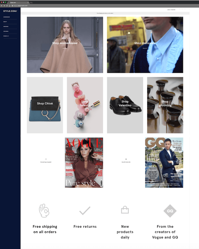
Here is the full home page on the web.
 The Plus & Minuses of Style.com
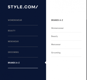
The site has one strong merit: it is clean and bereft of a confusing navigation. It is also a quick read on mobile. I might go so far as to say that it has a classic mobile-first type of architecture and style. On the other hand, it doesn’t exactly make me feel like discovering much. If the intention is to provide relevant and/or intriguing content, it seems notably bereft of such. Secondly, for a site that presents itself as a “premium” destination, it would seem only to premium by the types of brands it is housing, as opposed to the form and function of the site. Unlike other more endowed luxury brands, the site is stripped of “luxuriousness.” While the site speed is good, many of the images are still very high resolution and end up making the load-up sometimes a bit laborious.
Relationship with Collette Paris
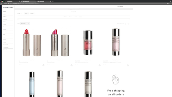
One of the interesting initiatives in style.com is the link up with Collette and the “Collette edits” that provide a curated set of products. If you don’t know Collette, then this might be lost on you. But, it’s a hip lifestyle store in the heart of Paris. It was where, for example, Apple pre-launched its Apple Watch 1. Meanwhile, I’d say the site has some teething pains. Specifically, the tagging doesn’t exactly feel right, or it’s just that the editors are trying to change the perception that skincare also be a lipstick. In their skincare line (in the beauty zone), Collette’s edits presented me with:
I don’t know about you, but does it not look more like a colorful make-up line up? Meanwhile, I would also note that the pricing is written in such small (light grey) print, it’s only readable for those of us who don’t need reading glasses (not a good UX, especially considering the traditional VOGUE audience).
A window into the internal struggle of digital transformation
What intrigues me about this project — about which I have no inside scoop — is the obvious internal challenge of making everyone happy in the multi-brand Conde Nast environment. There were presumably a lot of cross-brand, cross-boundary and cross-cultural wrinkles (and squabbles) to be ironed out. It does seem that the final product — that took 18 months to launch in its first market — provides a clue to the internal challenge of driving a digital transformation. Moreover, despite the latent credibility of titles such as Vogue, GQ and WIRED, it will be most interesting to see how ‘trustworthy’ such a site will be viewed by customers who are used to Amazon’s transparency and service, and even luxury flash sale sites like GILT. In a recent article I wrote, I highlighted the nosedive in trustworthiness of mass media (in the US). The challenge for an organization -- that is exactly a mass media company -- is to foster trust all the while hitting the short-term numbers. Share on X
I signed up for the style.com email, but still haven’t received anything so I can’t evaluate their email effectiveness, which will undoubtedly be a key success factor down the line. How will Conde Nast facilitate sharing of email lists between the different brands? Who will be the custodian of the customer in all that?
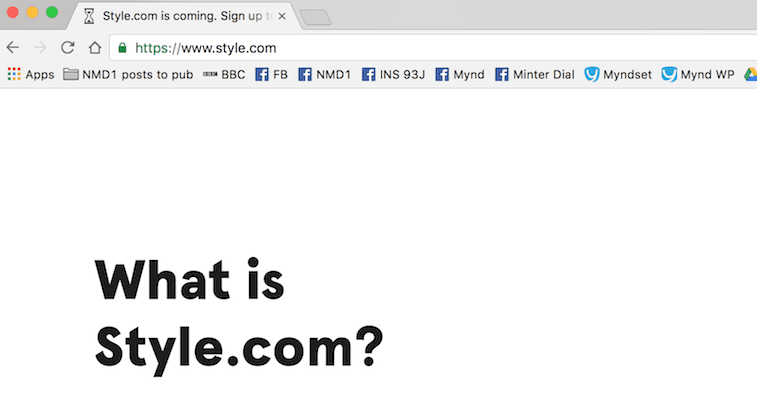
Bottom line: There are a lot of questions left unanswered…. just as the current splash page for those of you not in the UK announces:
Addendum:
One more thing, Style.com: don’t forget to change your “cute” favicon hourglass in the tab…. We’re no longer waiting. It’s arrived!


 The Plus & Minuses of Style.com