Having attended over 20 sessions at South By Southwest (SXSW) 2016, I got the chance to hear some wonderful storytelling and see some great presentations.  However, as can be expected with such a volume of sessions, the quality was hit or miss. Some presenters had rock star slides, some used presentations as a [bad] crutch and others still chose not to have any slides at all. Below are some of the lessons I learned for making a great presentation, geared for the more “evolved” crowd at SXSW. However, I dare say these tips can be used for most presentations dealing with a more connected audience (hint: most of the business world).
Great Presentations – Storytelling
The primary assumption is that you have a great story to tell. Something I observed, presumably taking a page out of the TED Talk formula: many of the best speakers started with a story. [tweetthis]If the story is personal, it is likely more engaging. #storytelling[/tweetthis]
Also, in order to make sure that people come to your session (i.e. in the brochure), you need a title that is tight and inviting. In the accompanying write-up make it clear what the audience will get out of the speech.
10 steps to a great presentation
-
-
- The first rule — that almost goes without saying — will be to have great content, focused on some key messages and the what’s in it for the audience. A smart idea is to start off with a story. Alternatively, if you want to connect with your audience, you can always begin with a question or two.
- If you are serious about your speech, it would be appropriate to rehearse (This of course doesn’t apply if you’re sitting on a panel). The need for rehearsal is even more important when there are two or more presenters. Share on X
- In the case of SXSW or other large conferences with multiple tracks on offer, unless you are divinely well-known, you’ll probably need to do some self-promotion. This is where you work the influencers you have cultivated over the years and call in some favors. I saw several speakers using their own network effectively to galvanize some buzz prior to their session.
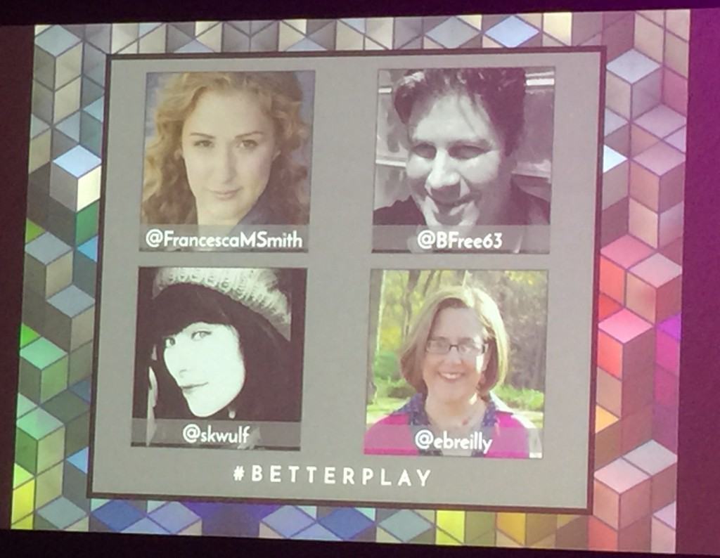
- When the presentation gets started, you need to ensure the introductory slide is well done. The intro slide sits there before the presentation starts. It should feature your presentation title and, ideally, an image of you the speaker, your @handle (for Twitter) and the hashtag of the session. N.B. In terms of hashtag, make sure to check how/if the hashtag has been used previously. Ideally, it should not be banal, nor long, nor hard to type on an iPhone keyboard.

A panel slide (#BetterPlay session) that was perfect at SXSW
-
-
-
- You’ll want to add your Twitter @handle and #hashtag in the bottom of all the slides.
- Try to limit yourself to no more than 15 words per slide (e.g. an easily tweetable >120 characters). A good way to go about this is to impose a minimum text size of 48pts, which ought to make the words readable from the back of the room.
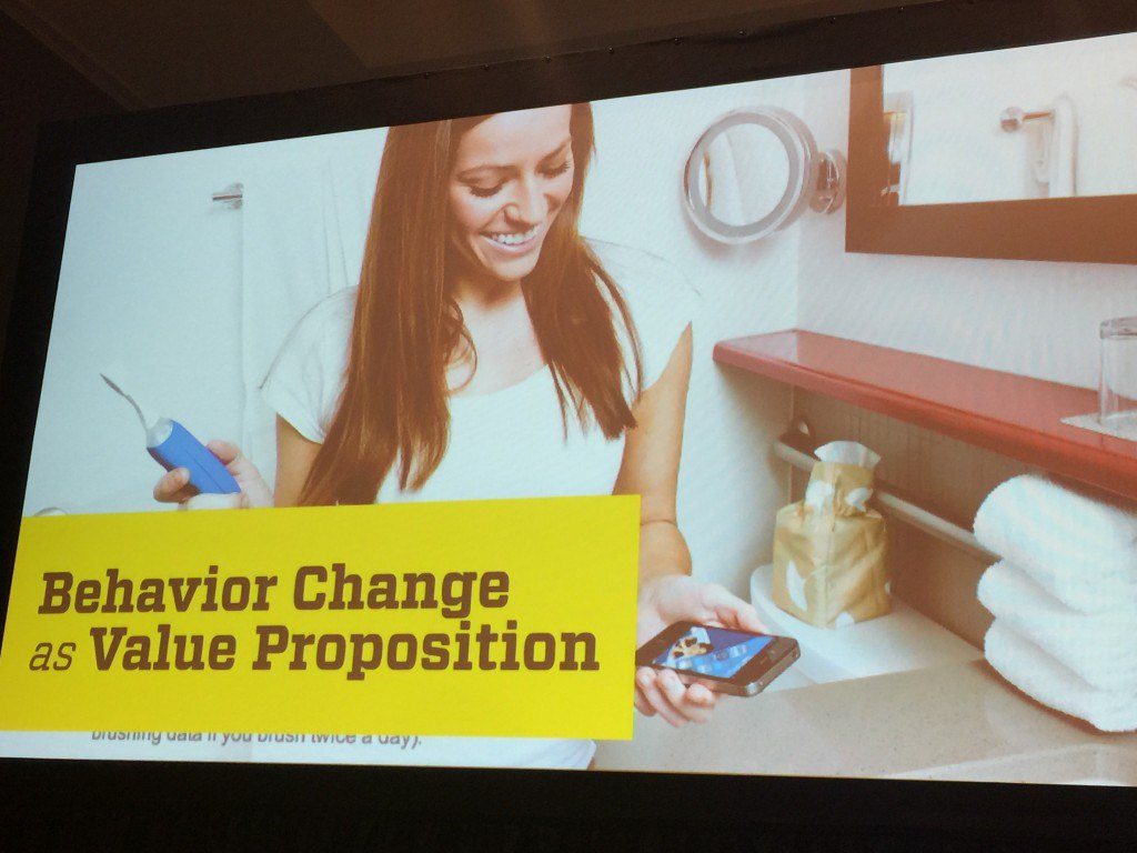
- Use powerful images whenever possible. Make sure they’re as original as possible (i.e. not stock photos).

Strong slide by Chris Risdon (Designing Behavior Change at Scale)
-
-
-
- Allow for space. Silence can be very powerful. You can also black out the presentation (type the letter b in the middle of your PPT or Keynote). This can even involve addressing an unexpected question and/or a conversation with the audience. The key is not to plan for a presentation that goes perfectly according to plan. [tweetthis]Allow for imperfection in your speech. #presentationskills[/tweetthis]
- For the Q&A at the end, remember to plant a good primer question in the audience, just in case the first question is hard to come.
- Add a considerate final slide. For example, it could be with a call-to-action, such as where to find the slides of the presentation on Slideshare. Alternatively, the CTA could be a QR code for an easy sign-up to a newsletter… etc. At the very least, provide the best way for the audience to connect with or follow you.
-
Let me know to what extent you like/agree or disagree with the above. Feel free to add in some new ones!

