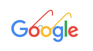
I needed to use a Google logo in a presentation and wanted to update for the new logo (see right). So, what better circular activity than to google the new Google Logo? To my surprise, it actually took a little rummaging around in Google Images. Here are the results using a series of different search requests:
Google Logo
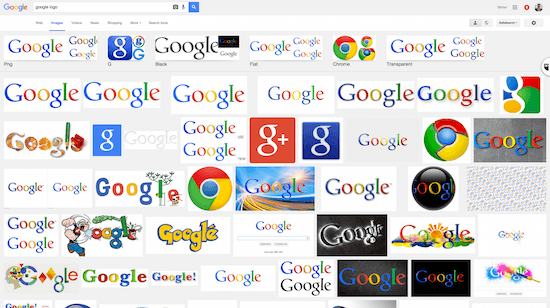
No luck. The first sign of the new logo was SEVEN pages down! When I googled just the word “google”, I also had to wait twelfth page until the new logo appeared.
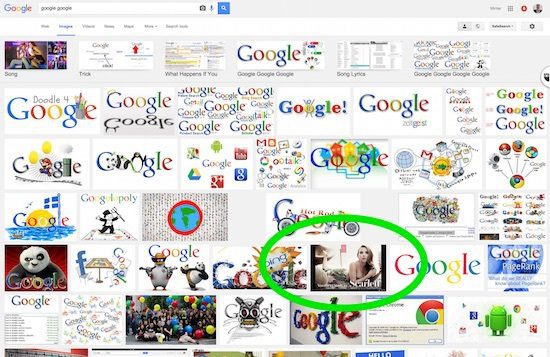
To google Google
When I wrote the search term <google google>, the results contained one little surprise in the top page (circled in green below)… and I wondered if that isn’t the work of some agency trying to do some supreme search engine optimisation (SEO). It turns out it is about Scarlett Johansson on Google Play, so not so off-key. The new logo appeared on the 10th page.
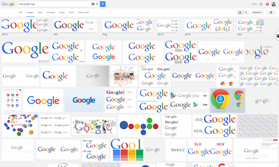
New Google logo
Perhaps less surprisingly, with the <new google logo> request, I found a first result on the first page.
Online Brand Charter
As brands try to figure out how to optimize their online branding, the change in logo for Google and their general manner of managing their branding is a radically far cry from the “traditional” school of marketing that insists that a logo appear in a certain position, type face, color, etc. I remember how at L’Oreal we would spend countless hours (and money) on creating brand charters to define the brand logo and presence across different formats. Is a strict brand charter still relevant online? When one looks at the results of one’s brand in Google Images, it’s a quick way to get a “view” of one’s online presence. How consistent is the presence, the logo, the visual …? To say that Google has its (SEO) work cut out for themselves in getting their new logo to arrive at the top of the results is an understatement. The challenge is all the more extraordinary in light of the fanciful and playful way with which Google has always played with its logo. And the work on their new corporate name, Alphabet? It’s a different ball game.
Alphabet pea soup…

Alphabet.com does not even belong to Google, so the .com address will likely remain a BMW property for all the extra “mileage” when people incorrectly fall on their site (unless the cheque from Google has a googol of numbers before the decimal period). Without much surprise, the search request for <Alphabet> miraculously returns the result of the company formerly-known-as-Google, abx.xyz! That’s the good news…
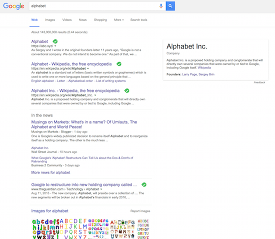
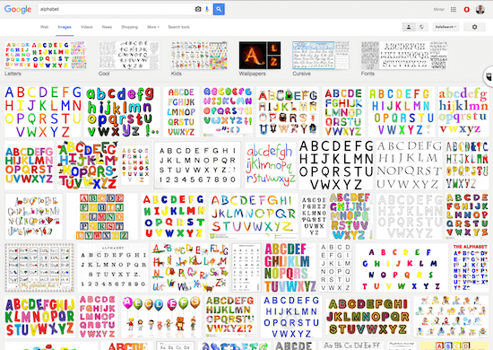
because, the results in Google Images brings up quite the alphabet soup muddle:
White Space as Branding
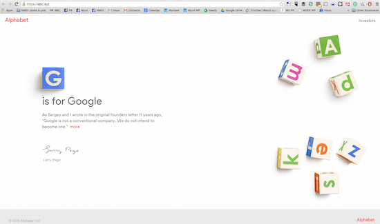
Meanwhile, if there is one thing that defines the Google presence, it has always been the remarkably clean white space around the name. And the current corporate brand charter for the new Alphabet is a loyal follow on:
Online Branding
Traditional notions of branding are under siege. Between having consistency in text, image and video — not to mention managing the presence in the top page in each of the three tabs — the challenge of brands to create a strong online presence will go far beyond a traditionally manicured or manipulated image Share on X. How flexible must one be? How to drive that consistency across the world, across the different search engines with their different algorithms and principles? Assuming Google and the other search engines don’t manipulate too much behind the scenes, the people’s choice will definitely help articulate one’s online branding presence. Let the google games begin (again)!
Your thoughts and reactions?




This post brilliantly highlights the complexities of online branding! It’s fascinating how a simple logo can carry so much meaning and lead to various interpretations. Minter’s insights on the challenges faced by companies in maintaining brand identity in the digital age are spot on. I’d love to hear more about how other brands have tackled similar issues!