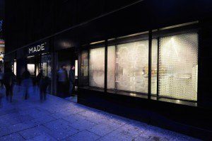
I had the chance to visit the new showroom of Made.com in London (that opened in January 2015). In terms of a blend of IRL and URL, Made.com has blazed a new digitail experience that’s worth the detour, whether or not you are in the market for some designer furniture. If you don’t know Made.com, it is a 5-year-old online retailer, co-founded by Brent Hoberman (founder of Lastminute.com), connecting buyers directly with a selection of designer furniture makers. As the site proclaims:
Without the middleman we connect you directly with designers, saving you up to 70% off prices at leading retailers…”
Weaving digital into the retail experience
With its location on a busy street (100 Charing Cross Road, SoHo), they have attacked the first, second and third rules of retail: location, location, location. But, the truth is that Made.com’s showroom is re-writing the retail rules and is anything but a traditional retail space. As I have often written regarding the merger of digital in retail (aka “digitail”), the challenge is providing the customer with a truly value-added experience, all the while keeping the staff involvement optimal. This is what I characterize as a digitail experience.
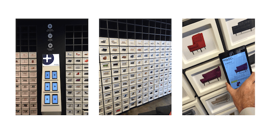
A splendid digitail experience
The four wows of the Made.com showroom were:
- Transparency. The showroom is also where the Made.com head offices are and, as proof of its transparency, the offices are separated from the showroom only with glass walls.
- Digitail Wall. The wall of items is attractive to look at, but the mini-tablet device presented in the middle of the wall is an immediate draw (on the left in the image above). With this mini-tablet in my hand, all of a sudden, the limitations of a physical showroom are seamlessly expanded into a fast-acting digital interface that details prices, alternative colors, etc. In addition, the device is intelligently designed to capture your interests and your personal email (good for CRM – see below).
- Attitude. Unlike so many stores that are hell-bent on stopping you from (or at the very least are suspicious if you are) filming and photographing, made.com staff welcomed it. Moreover, wifi was quickly volunteered. Showrooming is literally encouraged. Refreshing!
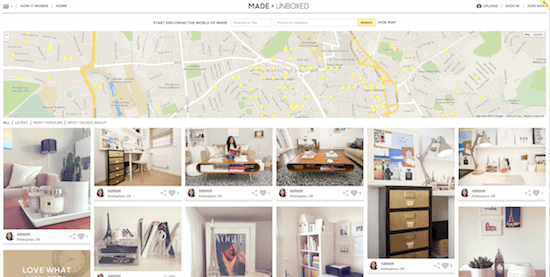
- Unboxed. In one of the most innovative UGC initiatives I have seen to-date — recognizing that having showrooms everywhere is impractical and, moreover, unaffordable — Made.com has created a service called “Unboxed.” This is essentially a system where potential customers can look at items in situ in other customers’ homes and, according to permissions granted, can even go and visit their home to touch and feel the item. Clients of Made.com can have their new furniture photographed (professionally) and logged on the made.unboxed site. Viewers can thus see an item in a real environment, see which pieces are most “liked” and then can even go see the item. The majority of the UK is thus covered with mini made.com showrooms.
Follow on…
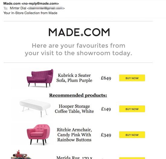
And, when I got home, I was greeted by the reminder email, in a very simple format, complete with a selection of recommended items.
Without doubt, the Made.com showroom is taking the digital in retail experience to another level, emboldened by a staff that is clearly devoted to the cause.
Feel free to add your comments and thoughts!







Trackbacks/Pingbacks