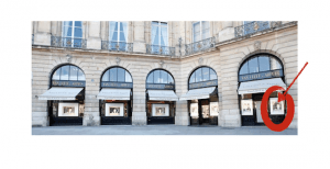
Van Cleef & Arpels (VCA), the famed luxury jeweller, has just launched a new initiative in the windows of its flagship store in Paris at Place Vendôme. Could it be a real luxury window shopping experience? Ever curious, I went to explore and experience the look & feel.
Opening the kimono
As Van Cleef Arpels explains on their site, with this virtual window, they wish to give a behind the scenes of its workshops thanks to…
a unique technological innovation: the 360° virtual tour.
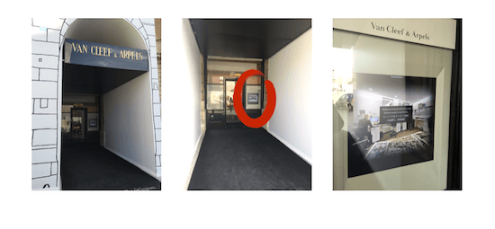
I’m not sure where is the “unique innovation” in this initiative (that is not explained), but it is obviously unique for VCA. The screen is installed in the window on the very far right of the store front, for the VCA Boutique du Temps Poétique. The attraction could easily be missed or misunderstood currently since the whole site is “under renovation.” The objective of Van Cleef Arpels was clearly to provide a view under the bonnet, some unique storytelling, where you can walk through the eight different phases of creation.
Luxury Window Shopping – on the positive side
What I liked:
- Van Cleef has leveraged its content and made it available online and at the storefront.
- There is a raw feeling to the video as it has been cut. You see people at work, complete with sounds of movement and sawing…
- There is a fine level of engagement by inviting the user to move the camera around as he/she wishes… You feel like you can scrutinize every nook and cranny of the workshops.
What I didn’t like:
 The video is not in real-time — the video gives the impression that it is live. I had to view it twice just to make sure that it was indeed just video footage. [You can see another brand — Bruichladdich, in the premium single malt whisky category– that provides real-time webcam videos — eg. check out the webcam for the Bruichladdich stillhouse]
- With the window display, the functionality is sub par. As you can witness in the YouTube video I uploaded above, the clickability is not very accurate, presumably due to the thick outer window (it may be burglary proof, but it does not make for a great tactile interface). As the video shows, there is a good deal of fussing and fighting to be done.
- It is a missed opportunity not to add sound outside. It’s true that the sounds when you are visiting online are quite muted. Perhaps a specific soundtrack for the tour outside might have been a good idea? With merely the visual and tactical aspects, it seems a shame not to enhance the experience with sound.
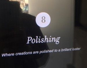
- A spelling mistake. The eighth phase, “Polishing” writes: “Where creations are polished to a brillant luster.” Hum.
Some other elements that need to be considered in making luxury window shopping a full experience:
 The personnel (notably the security guard) inside the store just kept on looking at me. It was a less than comfortable position. You would think that there might be a way to “engage” with a passerby instead of having a fishbowl approach? If I were media (for example, a blogger), then they could probably leverage the visit. If I were a consumer, they could engage. If I were competition, they could at least find out more?
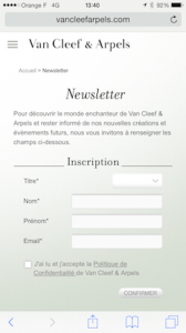
- The QR code (in the bottom left of the window screen) sends you directly to a newsletter sign-up, but the pop-up URL only has text (and newsletter) in French. Whereas, online VCA provide an English sign up and newsletter. I can’t imagine that’s a particularly successful QR hook for visiting tourists.
- You can find the four (as of today) tweets around the dedicated #VCAVirtualTour hashtag. Ironically, the preloaded Tweet on their site does not include the hashtag!
Van Cleef & Arpels invites you behind the scenes with a unique 360° virtual tour of its Paris workshops LesAteliers http://goo.gl/2W5fr {Tweet this if you wish!}
Overall, I applaud the idea; but, as always, closer attention to details, execution and usability is vital. Following online codes (real-time, hashtags, etc.) might be even better!
Your thoughts?

