Unfortunately, business cards are still an important business tool. I say unfortunately because it means we still have to cut down trees to print them up. And then we still have to go back to our desks to input the details into our contact database. Wasted time. Wasted resources. Meanwhile, we continue with the ritual of business card exchanges. All the same, in the era of digital and digital marketing, I am still very surprised with some of the business cards that are circulating. There are several degrees of bad out there.
Big Business – Business Cards for Executives
Here are some of the glaring mistakes that executives will make in big business (ie. the ones who can afford to have a team that normally have created a guideline/template). The first stop is on practical and/or esthetic matters (because that still counts). The second, further below, deals more with the specific notion of a digital or a digitally enhanced business card. Some basic business card errors:
- Unreadable. The text is too small, which is especially painful and irksome when each character of the email (for example) is vital.
- Too much information / overloaded. There are some great alternatives and services that allow you to embed much more information if you have too much for the 8.5cmx5.5cm real estate. An example is about.me which congregates the web presence.
- Inconsistency. I recently came back from an inter-company event where I was handed a dozen cards and there were at least four substantially different layouts and color codes.
- Impractical. In the end of the day, being different helps you stand out. However, for the most part, the really small business cards get lost in the shuffle and big index cards are unwieldy in the wallet.
- No English. I do not mean to be jingoistic, but for executives at big business, assuming there is business overseas and if the home language is non-English, it is hard to fathom not putting English on the backside.
- No space on which to write. One of the keys to good networking is to capture pertinent information on your contact. Oftentimes, in the search for creativity, a card will be printed in dark. Alternatively, it may be covered with a coating that makes a biro pen non operable.
Digital Business Cards for the digital mindset
Many companies are latching on to the need for digital transformation. And yet, their business cards, which in many cases represent a first impression and may be the lasting legacy of an encounter, often do little to support the idea that the company has a digital mindset. I regularly hear company CEO’s touting their “strategic emphasis on digital,” but the memo has clearly not been circulated to the Communications team or whomever is responsible for the business card layout. Herewith some errors (aka ‘room for improvement’) one might thus see:
- No internet site
- No mobile number
- No social media presence
- Including a fax machine number
Digital Business Cards for a digital agency
If an industrial company does not have a business card that is reflective of its digital strategy, it may be less sanctionable than a creative agency or, worse, a digital agency not having a digitally immersed business card. Notwithstanding the paradox of still having to use cardboard business cards as opposed to delightful immaterial applications such as BUMP, there are ways to make a business card more digital. Here are some examples of what I have observed on certain agency cards, over and above the issues cited above.
- Using a “www.” ahead of the internet site (no need to waste those four characters in the search bar either)
- No Social Media. At the very least, the main social media site should be on display. Typically, a digital agency should have several social media networks, so it may be impractical to display each. My suggestion is to use a congregated social presence that makes the social media footprint easy to understand. I am a fan of about.me, as I mentioned above, for the individual consultant (but this information can reside on page within the company website as well). Another good option is Vizify.
- No QR code with the vcf for automatic downloading into the contact database – and don’t forget not to use the formula of the “(0)” in front of the telephone number when the international code is cited. For example: +44207… instead of +44(0)207, which can be poorly interpreted by the smartphone.
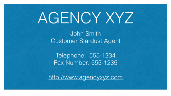
- No international code (e.g. +44 for the UK) for the telephone numbers [as depicted in the business card above]. In a worldwide web, people have a way of coming from everywhere! Another good option can be to add the Skype username.
Digital IQ
As senior executives continue to explore how to use digital to drive the business, one of the key components will be the general level of Digital IQ, in order to stay up to date with what is going on. Having an agency that provides valuable and up-to-date advise is surely an important contributor. I sincerely recommend looking to see if you agency knows how to walk the talk. My suggestion: review your business card and see what improvements can be made to have the business card be reflective of your de facto desire to be digital! Do you have any other thoughts or recommendations?




Minter, on your about.me profile you can add a Kred app – see this in the options section – have a look at mine http://andrewgrill.me