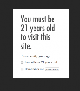
One of the main problems for alcohol companies on the web is getting consumers to get through the age verification process or what is called the “age gate.” On the hand, these brands need to comply with the law and to demonstrate good faith about drinking responsibly. On the other hand, does the legal team completely need to have the upper hand versus the brand? To what extent does the user and brand experience have to be compromised? Overall, I must say that I tend to view the concept of the age gate with a raised eyebrow. It’s really not like getting carded at a bar, so it’s not hard for a youngster to figure out the “ruse.” The point of this post is not to provide an exhaustive look at age gates, especially since it will depend on which country site you end up on. However, I wanted to highlight some of my findings and opportunities for improvement!
Why Age Gate deserves more attention
To begin with, the first page will have an important impact on conversion (i.e. those who enter the site). Secondly, it is also the very first impression one is leaving on the web for your brand where one has total control (albeit with legal restrictions) as opposed to operating a social media page (where the social network has a gatekeeping role to play). And, we all know the mantra about the not having a second chance at a first impression…?
Poor execution / User Interface
On balance, for having taken a look at some of the more popular alcohol brands, the vast majority have an age gate page that is, at best, ho-hum. As important as we all know the first impression is, it really feels as if not much thought or investment has been put into the Age Gate layout. Some of the poor executions I found on the age gate page:
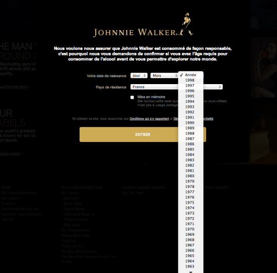
- Type face too small and unreadable (for example: Johnnie Walker)
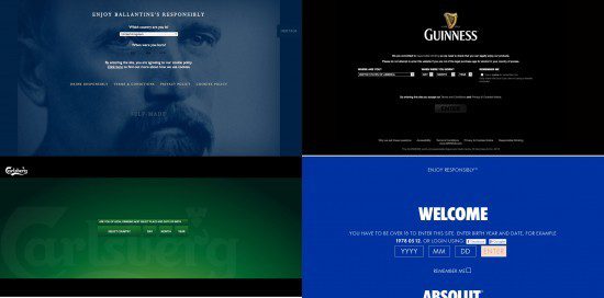
- Too confusing or too much information, with too many typefaces or fonts (for example: Baileys, Windhoek at Pure Beer)
- No explanation whatsoever on why the birthday is requested (Skyy…)
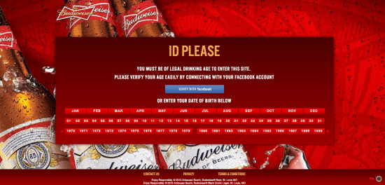
- Complicated (Budweiser – see below)
- Social plug-ins are just thrown on as if an after-thought (Absolut)
- A mistake (Jack Daniels asks you to correct the month, when it is the day that is missing) or poor English (see Johnnie Walker below).
- Some key information is left below the fold (Absolut)
- The site doesn’t automatically detect your country (making the user take an extra step to get in)
- Slow load time (example: Luis Martinez cigars)
Age Gate Crashing
For those who don’t get through the gate (theoretically the underage or those who type in the wrong information), there are generally four paths proposed by the different brands. I note that the path may vary according to the country in which you are surfing.
- A quick message is overlayed on the same layout saying only that the access is denied. The wording and presence can be more or less discrete. Example: Ballantine’s, Captain Morgan, Jose Cuervo, Skyy Vodka
- A new page is created with legalese saying that access has been denied. Example: Absolut Vodka
- A new page is opened explaining that access is denied and then the user is redirected to another site (usually some kind of site promoting responsible drinking, no drunk driving, no under age drinking, etc.). Examples: Jägermeister UK, Johnnie Walker UK
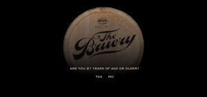
- The site sends you directly to another page that is more or less brand specific. Examples: Bacardi to Century Council site (a distillers’ association designed to help fight drunk driving and underage drinking, based out of the US).), Stolichnaya to Talk About Alcohol, The Perfect Lager Project to a kiddie’s site Wiggles.com, and The Bruery (above) sends you to GotChocolateMilk.
Many brands are rather expeditive about refusing entry. Skyy, for example, says unliterally, “You must be 21 years of age or older to enter.” They have made no effort to adapt according to the country’s legal drinking age.
Johnnie Walker – no award winner at the Age Gate
On the French site, Johnnie Walker’s drop down for the date only starts at 1998. This really encourages younger people to change their year of birth.
Notwithstanding the rather banal layout, if you are bounced out (“under age”), Johnnie Walker UK sends you to a very unfriendly “bounce” page that gives you a broad explanation that includes filling in the data wrong, having no rights in that country and being underage. However, the grammar of the text is wrong. Johnnie Walker writes, “Either you didn’t enter your date of birth in the European format…or due to marketing restrictions in your country.” In France, only the word “Désolé” is written, without any further explanation. Furthermore, the pop-up for Johnnie Walker is decidedly 1990s in look and feel (javascript or flash?), as if it hadn’t been updated since.

After some 10 seconds, the bounce page for the UK site kicks out to the Century Council site.
Budweiser – More bud than wiser age gating
Budweiser uses, as the first option, Facebook Connect for age verification. This is potentially smart because Budweiser thereby also gets access to your public timeline on Facebook, as well as your email address and friend list. However, personally I would not be thrilled at the idea of allowing such access to Budweiser. There is no reassurance in the sign up how Budweiser would plan to use that data. Meanwhile, if you don’t choose the Facebook option, the way to enter your age is over-complicated. They do not use a familiar system.
Three best cases for Age Gate inspiration
Even if none of these examples is perfect, there are some good lessons to be drawn from each. A mash up of all of them might be the best?
1/ Savanna Cider – data value exchange
Out of South Africa, Savanna Cider is a small brand with a personality. And it’s a personality that they aren’t afraid to show even on the Age Gate page. Out of the gate, Savanna says:
“Like all relationships, it’s a bit of give and take. We’ll divulge our lemony secrets, but you’re going to have to pass one teensy little test first. Ready? All you need to do is select the date on which you were gifted to the world.”
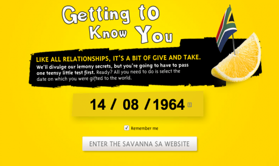 Aside from the fact that it makes me think of a breathalyzer, the sense of humor and the knowledge that there is value exchange is well considered. The underlying tenet is: if you give me your data, I shall give value back to you. In terms of value within, however, to my mind Savanna falls a little short in terms of demonstrating value to the user. The focus is on the Savanna commercials and product. There is no blog. No added value content. Moreover, the way the age gate is expressed, the idea is that the user needs to give before getting in return. My suggestion to the Savanna team: think what you will give the user in return for that date!
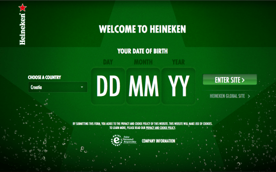
2/ Heineken – On brand & simple enough
In the realm of making the entry point simple (user friendly) and on brand, Heineken’s Age Gate is effective, if bereft of much sentiment. The country option is immediately cookied to where you are (I was in Croatia at the time) and the date of birth is limited to six digits (just two digits for the year). The layout is clean. Jose Cuervo does a similarly spartan job, albeit they state that the user must be 18 (which isn’t the legal age in every country).
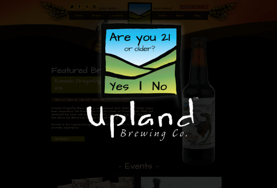
3/ Upland – Simple and vision beyond
What I particularly like about this solution is the fact that you can make out the brand site behind. I believe that’s an interesting spark to help get over the age gate. On the other hand, the oversimplification of the question and the fact that it only says “Are you 21 or older?” does not make the user sufficiently responsible for his/her choice. In addition, there is no explanation as to why there is the pop up (in case you didn’t know there was an age limit!).
UI enhancements
Here are a couple of easy user interface (UI) fixes:
 Automatically identify the country in which the user is (example: Stolichnaya, Heineken…)
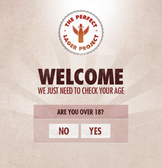
- Limit the number of fields to the strict minimum — to the extent the brand will not use the birthdate for any further purpose, is the birth date actually relevant? The Perfect Lager Project (below) and Fargo Brewing examples (right) are the simplest systems I could find… However, is it enough? In the case of The Perfect Lager, the glaring inadequacy is that they have put the age limit at 18 as opposed to Fargo (21).
- If using a birthdate, make the fields big and easy to understand (and automatically aligned according to the local custom — i.e. MM/DD/YYYY in US and DD/MM/YYYY in Rest of World… etc).
- Personally, I am not a fan of the drop down menu because it can be a little painful to use, especially on a mobile interface. I prefer the type in for desktop and spin-wheel menu for mobile.
Your thoughts and reactions are welcome. Everyone (all ages) are accepted here!
**For some good further reading, I highly suggest UX Movement which did a specific post on Age Gates with some great examples.





That’s what happens in regulated industries. Same in online gambling, any page that’s “ordered” internally by the legal department is often also designed and written by the legal department. You clearly pointed out a big area of improvement!
That’s what happens in regulated industries. Same in online gambling, any page that’s “ordered” internally by the legal department is often also designed and written by the legal department. You clearly pointed out a big area of improvement!
Great piece – really helpful for a pitch I’m working on!