My friend Roland Whitehead, CEO of Quru, whom I interviewed a few months back, inspired me to write a post about email signatures.
After reading an article I had tweeted from Social Media Today [link now defunct], Roland wrote in an email, “I come from an age where if you had an email address that was more than 2 lines long you were abused, often viciously, for wasting bandwidth. Small signatures are good. Unformatted emails are fabulous.” Herewith my point of view on what to do and what to avoid when creating your email signatures.
Email signature recommendations
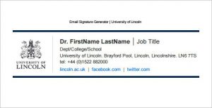
What of the use of buttons for social media? And, as Roland wrote, what about just writing a plain URL as opposed to “a 32×32 pixel icon that is about 500 words worth…”? Social media button overload is highly unappealing and confusing. This is why I personally like the about.me solution where you can congregate all your social media presence under one tidy space. I also tend to use two different email signatures depending to whom I am writing using Wise Stamp (one that is “personal” and the other that is strictly professional). Another handy solution is the .vcf card which conveniently uploads your address into most digital address books.
Junk email signatures
In terms of “junk” mail, as if it were not bad enough to have spam, there is a lot of junk in the way people sign off. Some choose to have no signature whatsoever (frustrating). Others go overboard with too many links (which means it can risk ending up in the spam folder) or too much information. Others still use images which cannot be copy & pasted. The email signature is clearly an undervalued part of our everyday communications, mostly because it is automated and falls off our radar.
Email signature tips & tricks
Things to avoid:
- Don’t include a “(0)” in your telephone numbers: e..g. +44 (0)207… because, written as such, the number is not operable when used to phone from smartphones (although I note that some systems such as the recent iOS now accommodate that protocol).
- Don’t have too many icons or links. Make your best channels clear.
- Don’t add your email address in the signature (as it manifest in the send from field).
- Don’t put your details as an image (e.g. a jpg or .gif). It is highly frustrating that you cannot copy & paste the text. Moreover, your mail will likely end up in the recipient’s spam.
- I don’t subscribe to putting a QR code into your email, especially if you consider how often people are reading with the device containing the QR reader! If you do use a QR code, make sure that it’s a dynamic one that allows you to update the destination as/when you update your details. You can try this service Go.QR.
- You no longer need to write “www” before your internet address (most systems now recognize a URL with .com attached).
- Yet, don’t be afraid to show your personality. I like to add a phrase that might bring comic relief or pause for thought.
Things to do (choose one!):
- Create a .vcf (here is how).
- Congregate your social media presence and relevant links on about.me.
- Use a service such as Wise Stamp to provide different signatures according to the recipient.
- Change your email signature in iOS from the basic “typed on the tiny iPhone keyboard…” to something that resembles you, that is more personalized.
- If nothing else, add your Twitter handle (@mdial).
I was reminded by Roland that, if you work for a company that is EU-based, then your work email address should, according to EU law, include your company registration details. Most people seem to ignore this rule. I have since come clean. {Thank you, Roland, for the heads up}.
Are you inspired to do the same?
For further reading, beyond the above mentioned SMT article, you can also check out my post about “Best automated email signatures for smartphones.“





Minter – Great posting and tips. Correct that EU law makes the mention of company registration and if applicable the VAT number a mandatory element to every company profiles/signature and by the way also mandatory on all websites related to these companies. An interesting link/page on this matter is:
http://www.policypatrol.com/tag/email-signatures/
Meets some of your remarks but also differs on some points but what annoys me most and I mean really most are emails sent from company individuals without in their "From:" line any reference to the company they are linked to. Emails from John Smith or Debbie Blow etc. whilst it should be John Smith | Solicitors at Law or Debbie Blow "Office supply specialists" etc.
You can never tell at a glance where these emails come from because most of the time these individuals are not known to the recipient to start with.
To come back to my remark on the previous topic "Cameras branding" in the printing world one is very in control of branding by issuing volumes on the correct way to use logo's, images, names, PMS colors – you name it. It seems to me that in the digital communication and email is certainly part of it, this aspect is overlooked. Why?
As some of my French friends point out and I like the wording association in this: "Les dirigeants des entreprises ou de l'état sont souvent des analphabètes numériques".
Havas Media France published in 2012 a study titled: 'La France des déconnectés' where it appeared that 25% of the population in France is not linked to internet. But unfortunately, I think, the number of Captains of Industry having an awkward relationship with the digital world is still adamant.
PS. I react here as an individual and not on behalf of any company, group or conglomerate -;)
Minter – Great posting and tips. Correct that EU law makes the mention of company registration and if applicable the VAT number a mandatory element to every company profiles/signature and by the way also mandatory on all websites related to these companies. An interesting link/page on this matter is:
http://www.policypatrol.com/tag/email-signatures/
Views similar to yours but also different is some aspects. What annoys me most in emails is messages with no reference to the company they originate from. Like from John Smith or Debbie Blow whilst it should be John Smith | Solicitors and Law makers or Debbie Blow "Office Supplies World” etc. You cannot at a glance see who the sender is since you do not know these individuals to star with.
Referring to my remark on your previous topic in Camera Branding, in the printing world one publishes volumes on how to use the company logo, name, description PMS colors – you name it, whilst it appears that in the digital world this aspect is largely overlooked. Why? Some French friends stated – and I like the word association in this – “Les dirigeants des entreprises sont souvent des analphabètes numériques”.
In 2012, Havas Media published a study called ‘La France des déconnectés’ where it appeared that 25% of the population in France is not connected to the internet. Unfortunately I think that Captains of industry and Heads of Government departments belong – although connected to the internet – to these “analphabètes numériques” who rely on their secretaries to handle their digital communication, hence the gaps.
PS. I here write as an individual not connected to a company of group of some sort. -;)
Minter – thank you very much for this very useful post. I'm rushing to improve mine!
Minter – thank you very much for this very useful post. I'm rushing to improve mine!
Hello, i read your blog occasionally and i own a similar one and i was just wondering if you get a lot of spam feedback?
If so how do you reduce it, any plugin or anything you can recommend?
I get so much lately it’s driving me mad so any help is very much appreciated.
Hello, i read your blog occasionally and i own a similar one and i was just wondering if you get a lot of spam feedback?
If so how do you reduce it, any plugin or anything you can recommend?
I get so much lately it’s driving me mad so any help is very much appreciated.
Very nice tips and great form of information about the email signatures.Email signatures are just your identity in document.So there should be proper authentication and verification is important.
Very nice tips and great form of information about the email signatures.Email signatures are just your identity in document.So there should be proper authentication and verification is important.
any advice on services like Wisestamp, except that work with Outlook, specifically outlook on android and IOS mobile devices?
My specific problem is I am trying to move my homemade text+image email signature used in Outlook on desktop to my outlook account on mobile device–but I am completely flummoxed how a mobile device can set up an email signature that includes text+image.
Any ideas would be truly appreciated.