As our worlds become evermore connected and inter-connected, a visible component to our networks could become more valuable. I have been quite fascinated by how different visual mapping tools help to visualize our networks and, more importantly, what they can help us to understand ourselves. I thought I would compare a few mapping tools that are available (and free) for different types of networks, including LinkedIn, Twitter and Facebook.
LinkedIn InMaps’ Visual Mapping – a birdseye view (literally)
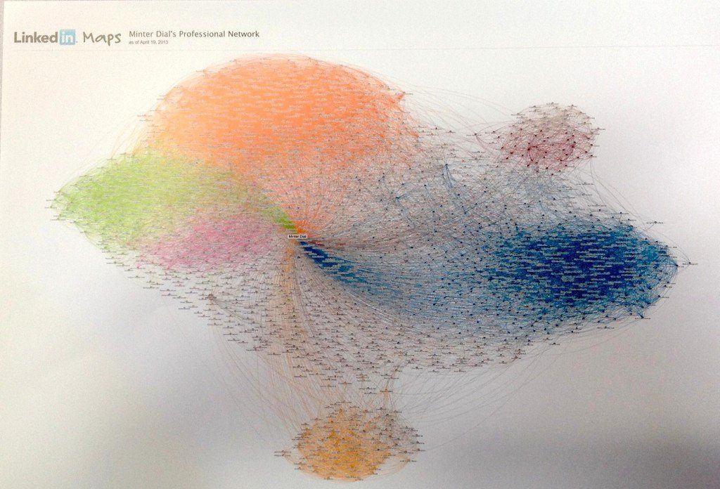
The LinkedIn InMaps tool that creates a mapping by interconnections is revealing in that it tells you what I characterize as your network “spheres.” What can I tell from this mapping? Outside of the Rorschach Test (please deposit in the comments what you think you see in this map), I would tend to conclude that I have two rather large communities, two lesser and two peripheral ones. Otherwise, LinkedIn’s internal mechanisms help you to take advantage of who knows who.
Twitter on the map
Thanks certainly to the open API, you can find many visual mapping tools of your Twitter network. There are a couple that I wanted to highlight for their readability. Otherwise, the question would be: what purpose do these mappings serve?
Twocation – Basic and easy
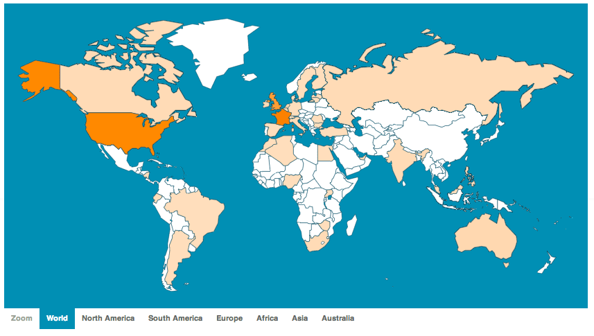
There is something to be said to making things simple. Apple made a tiny fortune by rendering the complex simple (because they never lost sight of the customer experience). Here is a basic map of my Twitter followers by Twocation, created by David Barker, out of London. It is rudimentary, but at least, it is quickly understandable as to where my Twitter audience lies: US, France and England. You can get a pop up of the exact number and percentage of followers by country. Beyond that, Twocation doesn’t exactly provide much value.
Tweepsmap – The devil is in the details?
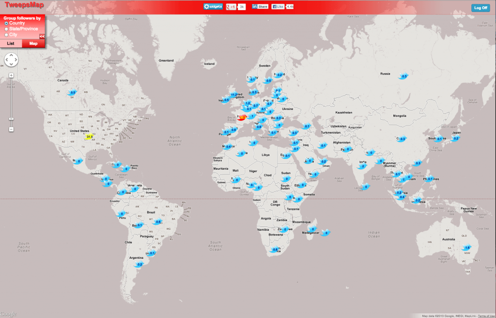
The mapping provided by Tweepsmap is rather simple (similar to Twocation), but it lacks in readability. The good news is that you have a more precise understanding country by country directly on the map (as opposed to a separate table in Twocation). Here one can observe two different colored birds, signifying the countries with the greatest representation. Not much in the realm of value add, otherwise. I’d say we have more devil than detail here.
Building your network over time…
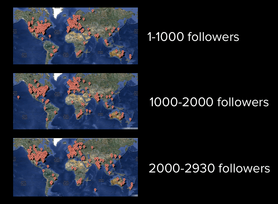
The next option is by MapMyFollowers and this one looks at your followers in increments of 1000, which works out to a chronological understanding of where you have built up a following. From the three tranches for me, below, you can see a spreading out of the followers, especially toward Asia.
Color-Coded Visual Mapping of your Facebook Network
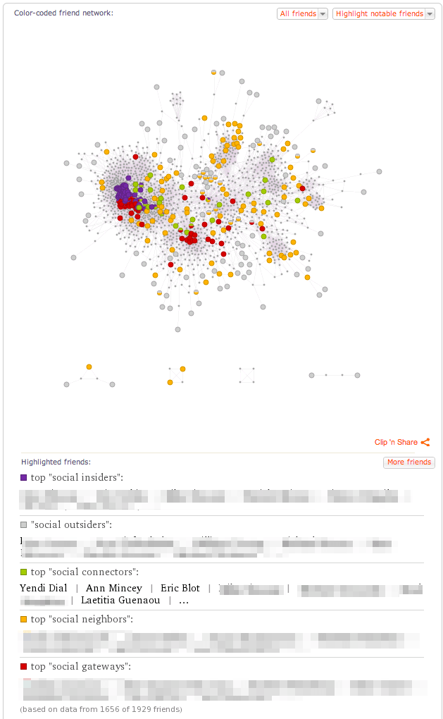
Moving over to Facebook, Wolfram Alpha has launched a new service that enables you to get a grip on your Facebook community. There a number of options, but I thought I’d highlight the color-coded network mapping.
The Wolfram Alpha mapping above plots my network of friends, showing who knows who and ascribes some to different categories: social insiders (share most friends), social outsiders (share at most one friend), social connectors (connect together different clusters of friends), social neighbors and social gateways. These last two bear some explaining. My Social Neighbor is someone with a small number of friends whom I don’t know. My Social Gateway friends are those who connect me to people outside my network. I like where this type of segmentation could lead. And I wonder what could be the applications for a brand page? Meanwhile, I must say that the Wolfram Alpha application is very robust and you can play with the data in multiple ways. Definitely worth the spin!
Klout – Literal Spheres of Influence
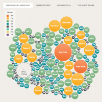
Klout has provided a visual mapping of the “influencers” in your network, where each circle is sized (and colored) according to the person’s klout score. Of the 1783 friends who have allowed their presence to be viewed from outside, just 234 (13.1%) have signed up for a Klout score. The purpose of the graph is to invite you, as a Klout user, to “influence your friends” to join Klout. To the extent you give kredit to the Klout score, this allows you to understand very quickly your immediate circle. For some reason, Klout doesn’t provide the same visual mapping for your Twitter followers.
BlueNod – Event-based real-time mapping
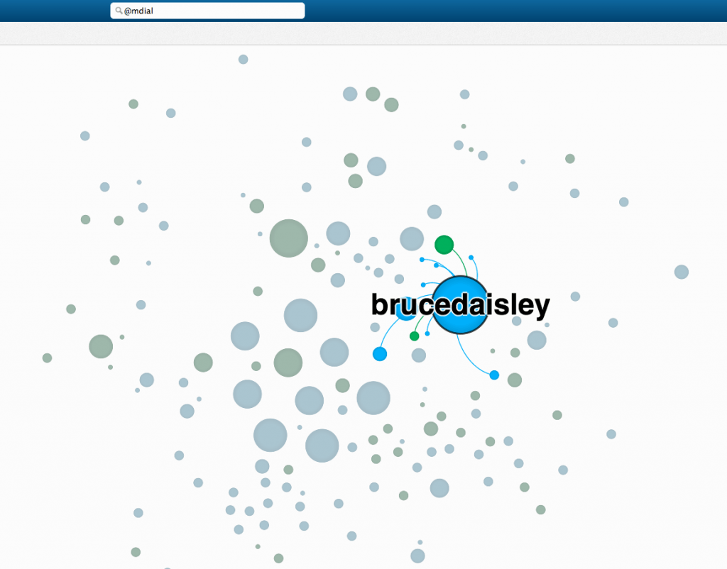
Last but not least, I would be remiss not to mention Blue Nod which creates interesting ways to map — using only Twitter — an event, user or hashtag in real-time. Blue Nod even provides a way to evaluate the influential Twitteratti during an event, which could have good implications for the more nimble marketers! The BlueNod visual mapping identifies people who follow you versus those who don’t. It connects them in ways that help understand the ebb and flow of a conference. If you’re doing an event, I highly recommend trying it out.
I’d love to hear about other visual mapping tools that caught your eye! Let me know which one you liked above? Or the ones you didn’t like! Always glad to have your comments!





Nice to readn,,……
Nice to readn,,……
Hi Minter, The issue with many mapping tools is that the “so what” is usually fairly fuzzy. I invite you to check Traackr’s network mapping to understand the influence that takes place with your group of influencers.
Hi Minter, The issue with many mapping tools is that the “so what” is usually fairly fuzzy. I invite you to check Traackr’s network mapping to understand the influence that takes place with your group of influencers.