
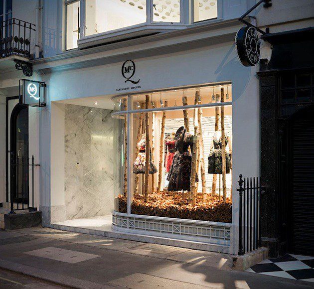
I made a presentation on behalf of Golden Eyes (CRM specialist services) at the Institute for French Merchandising (IFM) this week. The presentation was entitled (in French): Digital in the Retail Space – Friend or Foe? During the presentation I spoke about a few recent cases of how digital has been used in stores in London and New York. In this post, I wanted to highlight one of those cases, the Alexander McQueen flagship store in London.
Off Picadilly, the store is a small, cozy affair. To be exact, it is located at 4-5 Old Bond Street London W1S 4PD. Downstairs and upstairs, there are two different digital merchandising experiences.
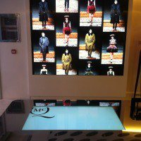
When you enter, you immediately see a large table which has a white screen embedded with a large screen to the left. This table is interactive allowing you to play with the latest collections and, even, to send them with a cool flick of the finger to be projected on the big screen. It is a highly enjoyable activity. There are a number of options you can project on table. And, there is also an option to capture your email (bravo).
Below is a short video of the experience. You will notice that the little image slips away from my fingers (that was a digital mistake!). Otherwise, it is an activity that invites discovery!
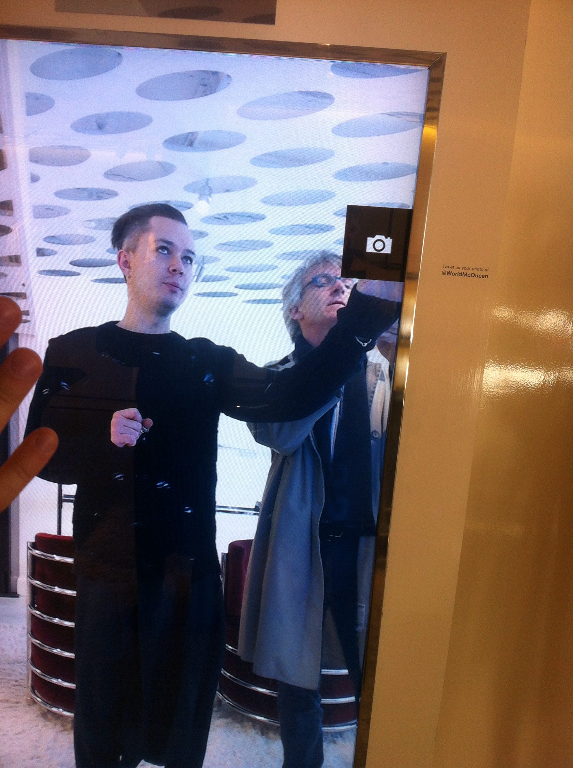
Then, upstairs, there is an interactive digital mirror that lets you take a photograph and send along to a friend on Facebook, etc. This idea is cute, but only worked with great perseverance. Multiple tries and a laborious sign-in to Facebook made this one, a work-in-progress; thus, definitely not a wow effect. Proof, that execution is critical. {Click to tweet this out, if you agree!}
When installing digital displays or digital merchandising, there can be a temptation to jump on the latest shiny object. The message is in the form and innovation means being bold. The key, however, is to be a devil on the details and to make sure that the experience is friendly and effective. Otherwise, the effect is entirely lost on the user!
On the other hand, being too keen on a ROI, can cause the element of discovery and surprise to be diminished. In the case of the interactive table on the ground floor, it is tremendously well done. And, I gave my email address willingly after the multiple surprises. A solid ROI I would believe (not to forget this blog post!). Worth the visit!

