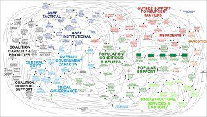
Over the last few days, I have read a number of reports of the horrors of PowerPoint. It seemed to start with the New York Times article about the illusionary trap of Powerpoint presentations used by US Army ‘intelligence’ which stimulated a post by Jonathan Salem Baskin and another by Seth Godin “PowerPoint makes us stupid, These bullets can Kill“. AKA (not AK47) Google Trends meets Death by PowerPoint. One of the [power]points that got my attention was the slide which was the “butt” of all jokes, captured below. It is apparently a slide designed to explain the complexity of the American strategy in Afghanistan. Mission accomplished!

The first thing that caught my attention about this particular slide was that it more or less looks like the way people describe the Internet. Everything is connected! As my Montreal friend Mitch Joel would say, there are now six pixels of separation between everyone and everything. Here is an example:

Use, overuse and abuse of powerpoint is hardly a new topic, even in the US Armed Forces. In July 2009, Starbuck (akaCapt. Crispin Burke, an Army operations officer at Fort Drum, N.Y.) published an article [no longer available] in which he wrote, that Powerpoint is itself not to blame, “[r]ather, our over-reliance on slide-view software, over-filtering of information, and over-simplification of complex ideas into small bullet points and cartoons is to blame for our communication errors.” As if on cue, McKinsey just published an article in its Quarterly “Putting organizational complexity in its place.” The article points out the differences between organisational complexity and the complexity experienced by the individual. There are certainly many complex matters rendered worse by lack of clarity and transparency. Personally, I continue to believe that finding elegant solutions in a complex world and rendering them simple to understand is an exquisite art form.
Powerpoint gets a bad rap for the way it dummies us down, or rather the way it makes people present in a linear fashion, with stereotypical codes of Title, subtitle, bullet point 1, sub bullet point 2, upper case letter A, lower nutcase. But, where to draw the line between “dummying down” and rendering the complex understandable? The debate may rage on whether simplicity is better than complexity, but the truth is that it all depends. Bullets are coming under fire today, but as far as presentations go, we should all still love kissing, as the audience has a higher than average chance of understanding even mediocre material when the message is simple, direct and limited to three main points.
Personally, my biggest beef with Powerpoint was that it just was so un-innovative until Keynotes woke it out of its slumber. Maybe we should be talking of the Steve Jobs effect on presentations, accentuated by the beauty and elegance of the Keynotes utilities.
So often, you will hear someone say “don’t shoot me, I’m just the messenger”. But, when powerpoint meets the impotent presenter…in this case, the messenger that uses Powerpoint is typically the one deserving the bullets.
Here are my three top “points” to a great presentation:
- Prepare and rehearse. Know your material. Check that the electronics, connections and gadgets all work!
- Create a storyline that threads throughout and links each of the slides.
- Less is more. If you focus on what you want the audience to remember/come away with, THAT is your objective at all times. An audience can invariably only come away with a limited number of thoughts that will endure. Using appropriate images, single words, video and sound are all part of making the presentation a memorable experience. And, per the TED motto, shorter is better than longer…
Your thoughts and reactions? Please don’t hesitate to comment or rebutt!


Trackbacks/Pingbacks