Email marketing remains one of the main pillars of any normal marketing strategy. It still provides a great Return on Investment considering the cost per communication, even if open rates for mass marketers often toil to get over 2%. Regulations continue to evolve, no more so than in Europe with upcoming new General Data Protection Regulation (GDPR). But, an area that has always fascinated me is the UNSUBSCRIBE element of newsletters. And it’s a question that no boss will even WANT to ask: How easy is it for someone to unsubscribe from our newsletter? Share on X Many companies seem to go to great lengths to make unsubscribing as difficult as possible. Having just gone through a veritable spring cleaning of unnecessary newsletters in my inbox, I got a chance to check out how brands are managing the unsubscribe function.
This list looks at some more or less egregious tactics:
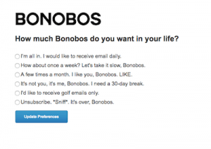
Bonobos (now part of Walmart) asks with a bit of humor to stay in touch
- no option whatsoever to unsubscribe (e.g. LadenburgThalmann Research, Burston Marsteller, a PR company!…) NB I never signed up with them in the first place
- an unsubscribe button that tricks you into signing up again (e.g. Twoo)
- create multiple steps/clicks (Hyatt Hotels)
- worse yet, the need to sign in to your account in order to change subscription, so you need to go find your login and password (e.g. Sephora [part of LVMH], The Times)
- very small print hidden in the bottom footer (many)
- reduced visibility color for the word (many, e.g. William Chris Wines)
- one last pop up to “make sure” (e.g. La Redoute, Product Hunt)
- provide lesser options such as less frequency (e.g. Bonobos does this with a sense of humor – see right)
- don’t create a mobile friendly version (e.g. OpenMarket – see below)
- …
And it doesn’t end there. Many sites will force upon unsubscribers one last visit to their site, in the hopes that it will make them regret their unsubscription or, better yet, make one last purchase. Others will send a last “sorry to see you go” mail in the hopes that it was just a mistake “by someone to whom you had forwarded the newsletter.” (e.g. The Hub Institute).
Should You Have A One-Click Easy Unsubscribe?
Is a One-click Unsubscribe the best solution? In this post by a titan of digital marketing, Jeff Bullas swears away from making it that easy to unsubscribe or you may risk losing by mistake “a hard-earned subscriber” (see point #4 in his post). It’s a fine balance between making it user-friendly and adding that little bit of friction. It’s true that some people might hit the button by error on a small mobile interface. Having a second step that either asks why you are unsubscribing or just to confirm your selection is a decent and acceptable option. Afterwards, if you ask why they are unsubscribing, the question is: what do you do with that data?
Bottom line: Unsubscribe is still part of the user experience. If you believe that you need to stop the bleeding at the unsubscribe moment, you clearly have not done your homework upstream. Of course, it’s fair to ask a question as they go, etc., but a brand just can’t hope that, by making it hard, it will win over their customer.
The ONLY appropriate tactic is to make killer content that the subscriber will be thankful you sent them. #unsubscribetobadcontent #emailmarketing Share on XExamples of UNSUBSCRIBE User Experiences
Below are just a few other examples of the different unsubscribe user experiences, more or less trying to keep the subscriber from unsubscribing too easily.
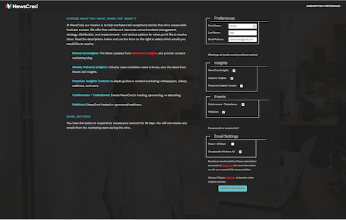
NewsCred (you need to look down on the bottom right)
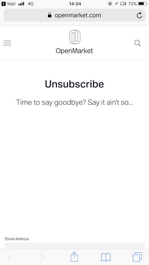
OpenMarket mobile version… you need to scroll down the unnecessary blank space
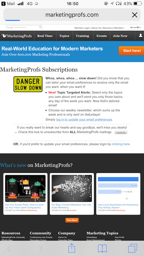
MarketingProfs gives a DANGER warning and an option to reduce, not just unsubscribe
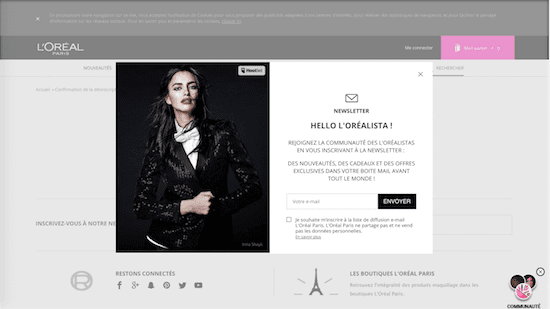
Once you unsubscribe from LOrealParis.fr, you get kicked out to a page with an automated popup page asking you to sign up. This popup masks the underlying Unsubscribe Confirmation!
Happy to hear your point of view or about other techniques for the unsubscribe user experience?

