This winter, Eurostar finally started to roll out its new e320 train. Being a regular Eurostar passenger, I was very keen to experience the improvements. Notably, I was very excited to get wifi onboard…at last.
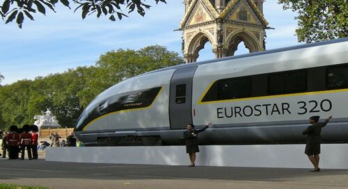
According to their site, the design of the new Eurostar e320 train was created by Pininfarina, “the world-famous Italian design house that creates Ferrari’s unique style.” With great aplomb, Eurostar announced that their new trains “will present the ultimate in design, comfort and service.” Siemens was the manufacturer.
So, what are the improvements?
- 894 pax versus 750 per train
- New type of seat
- New lighting
- New electronic signage
- Wifi onboard
- Did I mention 894 pax versus 750 per train?
- …
Customer Experience
What happens when a monopolistic or bureaucratically run transportation company decides to renovate its offer? The chances are that the first port of call will be on efficiencies and cost savings. It turns out that Eurostar forgot to think of the passenger experience in their design conception. Where to start?
Better Safety?

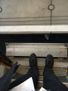
It’s possible that there are some obscured improvements in security that are not visible to the naked customer’s eye. Meanwhile, when you disembark, you surely see how they have considered our safety. Specifically, you have to deal with treacherously dangerous steps. Roughly six or so inches in width, there are two steps before reaching the platform. To the extent the platform is substantially further than the two steps, there is a large void to walk over too. For the valid – with or without a suitcase – you need to pay attention. For someone with a cane, crutches or who is elderly, the stairs represent a wicked descent.
New Suspension
Turns out that there is a new suspension system in use. Well, this is less obscure because you actually get to hear it when you sit next to it. Every five minutes or so, it lets out a huge sigh. In between, you get regular panting. Hear here.
Wifi Notwork
This was supposedly the big and GOOD news, at least as far as I was concerned.

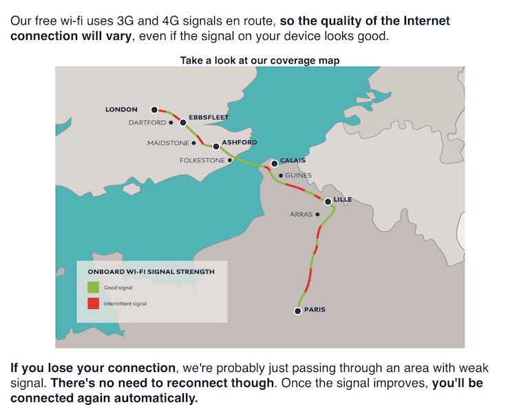
Granted I am no technician, but the Eurostar has taken donkey’s ages to come up with a wifi system for its new high-speed trains. Whereas I was warned that it was ‘technically’ difficult – despite the installation of wifi in Amtrak (US) and Virgin (UK) – it seems that the technicity was way beyond them. The good news is that they prepare you for it, alerting you to the [very] poor connectivity. The map that Eurostar provides us with suggests that about 50% of the journey will provide “good signal” and 50% intermittent. I think that the better part of transparency would have been to write “50% spotty to bad” and 50% “none at all”. On a recent trip that was half full, that was the best I experienced. As for wifi in the passage, they should also replace the GREEN with RED for the entire passage. Expectations have been incorrectly set.
Seating

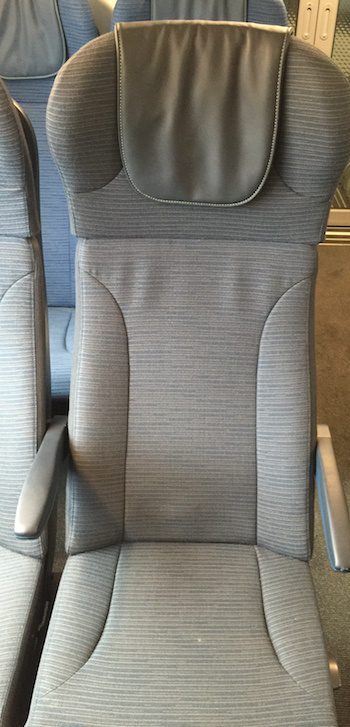
The brand new seats are awfully uncomfortable. They are hard on the bum and the [small] armrests are made of an overly firm plastic. The headrest component seems to be designed for a man who is 5”10 or above. For the smaller people (e.g. women and kids), there is no adjustment possible. I miss the old seats.
Lighting
Whereas the old trains had little lights for each seat, the new trains thought to do away with this. Instead, we have neon lights that are on all the time, regardless of the ambient lighting. The light is decidedly aggressive and uncomfortable on the eye.
In Between Carriages
Not that everyone heeds the notion, but when you want to talk on the phone, I believe it is only normal (and considerate) to step into the space in between carriages to talk on the phone. The new trains have no place to sit. In fact, the décor is positively spartan. In the old trains, there were pull-down chairs in the old carriages. Gone.
Fixtures and Finishings
At this point, you might be thinking I am a nit-picker. Well, some say that the devil is in the details. At this foursquare seating, the table fixture came apart in my hands. Even the pursar on board was horrified, shaking his head. You could tell that this was far from the first evidence of shoddy workmanship.
PA System
Scratchy would be an appropriate term. Hear here.
First Class
The same hard seats exist in First Class as in Standard Class.
The wifi is no better than in Standard.
In first class, they have installed “private” spaces where you can reserve a cabin that is closed off, obscured from other passengers for a meeting, for example. Of course, it’s completely obscure how to get access to these when you reserve.
Business Traveler Check-in – a Question of Culture
It’s worth making a final point about the difference between checking in at St Pancras and at Gare du Nord. Other than the miserable state of affairs of the Gare du Nord train station, in general, versus the clean, modern and wifi-enabled St Pancras, the Eurostar access for business travel/carte blanche is radically different. The French police at customs, believing that it is undue discrimination, do not allow for an express lane for business class or Carte Blanche travellers (as opposed to St Pancras).
Conclusions
My conclusion is that the design of a formula 1 car and/or high-speed performance vehicle are not credentials to design a passenger train. You get the feeling that the selection of this design house was more about a boondoggle for Eurostar’s senior management to ride in a Ferrari or two. At a minimum, for Eurostar senior management, I might suggest reading Brian Solis’ X. Of course, there are financial considerations; but you have to imagine the types of discussions that went into the design of these new trains never included any genuine interest in customer comfort or customer experience. When designing your product -- and you are genuinely concerned with your customer experience -- it is vital to include the users in the design process Share on X From the number of complaints that I alone have heard, in such a short period of time, you know that the customer was not included in the design conception.
***If you like my writing and are interested in fostering more meaningful conversations in our society, please check out my Dialogos Substack. This newsletter will feature articles on why and how we can all improve our conversations, whether it’s at home, with friends, in society at large or at work. Subscription is free, but if you see value in it, you are welcome to contribute both materially and through your comments. Sign up here:


I could not agree more with ALL of your comments. I take this train on a very regular basis and it is just not good. Couple of things you forgot to mention: as higher speed it shakes and rolls much more than the old carriages and induces motion sickness. Also they have done away with the two-shelf storage overhead, replacing it with a single shelf. Whereas before I could put a jacket and then above my briefcase, now my jacket rest on top of my briefcase.
Hi @Vermeire, the lack of a nice place for the jacket is another thing I hadn’t picked up…. so right!
Eurostar Seriously Downgrades Travel – Agree with all the comments. It was the worst travel experience since I took Ryan Air (never again) several years ago.
My main frustrations: poor quality seats in business – and also more cramped – and then the white-blue torture lights that can cause epileptic seizures, a shade of white you only see in morgues and Greek hospital mortuaries. Super uncomfortable. Shameful.
I am now trying to find a way to travel with the train numbers and traveling only on “old” trains.
And the worst: nobody at Eurostar cares.
Touché Jeroen. They roll their eyes knowingly.
Agree! I thought it was only me… the new trains are noisier, partially because of the lack of fabric and sound dampening. Sit in one of the lovely old ones and you’re bathed in this kind of muted quiet. Smashing! The new ones are like sitting in a shipping container. Shake rattle and roll… but, the pax trumps all, I guess.
Torture rack new seating a disgrace. Heads should roll for whichever imbecile designed these. How hard is it to design a comfortable seat? Id suggest designing an uncomfortable one is harder. im 6ft tall but it was impossible for me to be able to rest my head back. The side headrest ears are useless u would have to have a head as wide as two crenshaw melons to have a chance of using it ditto the headrest must be solely for 7ft giants. The seat is very hard my bum ached terribly and shifting position was a titanic struggle. They might as well have had concrete seats. Equally the spine is in such a unnatural position the way the seat is designed it would not suprise me if regular travellers develop slipped discs…… A national disgrace and fiasco from start to finish
It is indeed a travesty, @Eghardht. You wonder the size and shape of the engineer who designed it?! Or was it purely a financial guy who called the shots as to what would be the cheapest, most durable? I see a lot of eye-rolling by Eurostar staff, but no responsibility taken! The problem is that we don’t exactly have a viable choice, eh!
I might add that despite the comments on the aggressive lighting the lack of individual lighting means that it is impossible to read at night.
You haven’t mentioned the dreadful alignment of the windows with the seats. Nice to admire the view when you have no window, just a pillar to look out at. And yes the horrible seats are like concrete.
Finally, why is there no longer any hot water in the toilets to wash your hands?
I am constantly surprised by the unending list of poor user experiences… To think that no one from Eurostar has dared to own up to these poor decisions. For having spoken to them at the beginning, I heard things: higher passenger load, more efficiencies, competitive pressures… But certainly didn’t translate into a better passenger experience!
I’m on the train at the moment. I’m 5’ 1 and I’ve never sat in such an uncomfortable seat. It’s hard- there is some kind of lumbar support digging in my back and I can’t sit up straight because the backrest is so tall and slanted. I’m having to arch my back to try to sit. Even worse with the footrest. Who on earth designed this seat? Certainly no one that cares at all about the people sitting in them. How anyone taller than me can sit comfortably with their legs not under their chins is beyond me. And can’t put anything in the racks above as I can’t reach!
What a horror! It just makes you wonder how decisions on design are taken sometimes. I’m 5″11 and am also too short to benefit from the headrest. Hummm! On a similar note, my wife often complains about the height of the racks on which we have to put the suitcases at St Pancras. Hope you enjoy Paris all the same (assuming that’s where you’re headed!)
Hi
I am trying to write this while travelling in business class in Eurostar. I am struggling to write as the near constant feeling of turbulence makes actually pressing a key near impossible, let alone the nausea it generates.
I travel fairly regularly by Eurostar and am amazed how poor the new trains ride versus the old.
Such an obvious exercise in poor selection choice. How can a company who only objective is to provide its consumer with a fast comfortable journey fail so poorly.
I may consider flying in future as it’s a gamble as to which train you travel, old perfection or new horrors. I would rather spend longer flying than suffer the nausea enduring torture.
How was this possible?
Hi Graham, Rather remarkable eh! The old trains weren’t perfection exactly (no wifi!),,,, but I certainly breathe a happier sigh when I see it’s an old one for me! Problem is, the plane isn’t a practical alternative, considering the time saving.
I have found this site while during a search to compare seat comfort of the highly praised Eurostar 320 service,(Travelmantory video} started Apr., 2018 with that of Brightline fast train in Florida, USA
(While I have ridden ICE DB and SNCF double-decker rail coaches, I have yet to travel on a Eurostar service.).
What a surprise to find complaints about Siemens’ Eurostar 320 seating. So, from what is stated above it appears to indicate that the new Eurostar seats are not as comfortable as one would expect for a
high speed train.
From personal experience I can say that Brightline non-adjustable seats in Siemens’ coaches are tolerable for a ride within southeast Florida: West Palm Beach – Fort Lauderdale – Miami.
For a future three hour trip to Orlando I am not sure. In any case, tracks between the Orlando and the coastal junction at Cocoa, FL are not completed (05.SEP.2018)
Hi Michael, From what you see, are the train insides comparable? The Eurostar seats have a minor adjustability, but the headrest (which doesn’t work in the first place) is far too high for people below 6’… As for the rest of the Eurostar coach design, a lot of misgivings. Happy travels all the same!
I went out business class on the old train and came back on the new train and my first impression was that they’d made a mistake with my booking. Bad design doesn’t age well and the seats and carpets were stained, tatty and ugly. The seats were just terrible – so horribly uncomfortable with a faux leather headrest that made my neck sweaty, no recline and sharp bits everywhere rather than something to lean on and fall asleep against. Every seat bar half the table seats was travelling backwards in a headache-inducingly bright light. Waste of money, a monstruos f*** up.
Absolutely outrageous Ben. You know it’s bad if you feel that you’ve been downgraded by riding in the new train!
Finally an article that accurately summarises my frustrations with Eurostar. As a frequent traveller in Business Premier I find standards for £450 per return trip London to Paris shocking. In addition to your observations, the water dribbles from the tap in the toilet (and is cold another comment pointed out). My train this morning had water running across the toilet floor and was disgusting. All in all pretty shoddy.
@JP £450 is supremely expensive, I agree!
I am currently travelling to Paris (in the new trains), and I was looking for a complaint section somewhere to express my frustration to Eurostar to let them know how poorly designed were the new ones. I cannot agree more than all the comments made in this article, everything is accurate. I just want to bring attention to another annoyance that had been changed with the new ones: why on earth did they change the positioning of the seats ? Now we are facing people all time long opposite the alley! I cannot say that my neighbours are ugly, but if you want to rest you simply cannot as a matter of fact people are moving and as a result your eyes catch even their small moves and it’s quite painful. No offence but I don’t care knowing which sandwich they picked at Pret A Manger. Another question : why did they put the 4 seats facing each other every 3 seats?? Again if you want to rest there is no way to find a seat away from those 4 postions seats. Finally did someone as ever again had a drink standing in the bar wagon ? If you like surfing, you can try it even the Eurostar’s team members are feeling sea sick in the new ones due to the tumbling and the fact that the windows are so small you could feel in prison as you cannot see the horizon line (which oddly enough is needed if you don’t want to feel sick). So let’s hope some of our remarks and complains will be listened one day. At the end of the day the journey is ridiculously overpriced for the service delivered.
Hey BL, am glad to be a repository of the accumulated complaints. Your further observations are well noted. I still wonder if the engineers and individuals responsible for the design and signing the purchase order were ever held to account! Were there genuine competition, we might not have been served up such a poor design that, at its heart, was ALL about efficiencies and cost savings. The notion of creating a better experience for the paying customer can be resumed by the offer of free wifi: spotty (and pockmarked), at best.
I hope that your visit to Paris was enjoyable all the same.