I attended an event at one of the premier “serviced office” spaces (called Spaces, run by the US company Regus).
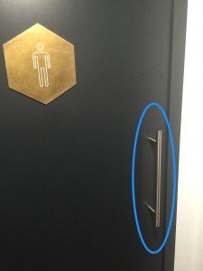
If the event was otherwise a success and the general environment in the office space was quite pleasing, I was struck by the experience in the men’s loo. First, the door. When you see a door that looks like this (see the handle to the right), which way do you think the door swings?
Push or Pull?
It’s to be pulled right? Wrong. No big deal, you live and learn.
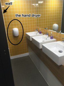 Once inside, the real hand wringing begins. There is a narrow row of three sinks. At the end of the row is the unique hand dryer (see left). There are no towels or alternative ways to dry your hands, so you have to use that machine.
So, how on earth is one to pass by someone who is washing his hands. In the photo to the right, I am standing upright at the sink. There’s a gap of about a foot. However, I had to bend over to wash my hands properly, meaning I obstructed the passage to the hand dryer for anyone wishing to get by. Worse, someone using the third sink is right on top of the dryer.
Finally, as far as the positioning of the hand-dryer on the wall, it sits just above the knees. You have to bend over inordinately in order to get your hands under the heat. [See the height compared to the sinks].
Bad Design Culture
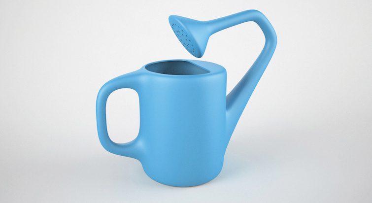
This is a classic case of terribly bad design. At least two things must have happened in order for this stupidity to occur. First, the architect/interior designer probably did the drawings at his desk, with zero empathy. Secondly, the builder didn’t have the authority or motivation to point it out while following the instructions. It surely would not have taken long to figure out the errors of their ways. More and more, as Brian Solis has written in his latest book, X, a brand is really about the experience.
Not that one will judge an office space by its water closet, but it does leave one smirking, if not suspicious about other finer details. If I speak about this offline design error here, it is to remind us all that the same issues of design come to bear online, on websites, mobile sites and apps, too.
Creating a good design requires being in the customers' shoes. Share on X On the other hand, creating a great design requires insights and heightened empathy.

