Using an iPad as a menu for a restaurant is hardly innovative today. That said, it certainly isn’t the norm (yet). As restaurants come to grips with the notion of becoming a “digital restaurant” and dealing with its ever connected customers, there is inevitably a need to trial new methods of creating a superior customer experience and engaging with its customers.
The Digital Menu
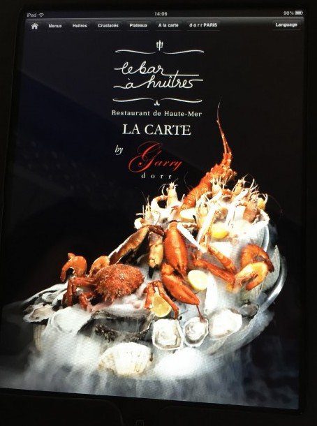
I recently had the pleasure to lunch at Le Bar à Huitres (33 rue Saint-Jacques, Paris 75005) part of the Garry Dorr Group, which has 11 locations under management. Upon seating, the maitre d’ provided a leather-bound iPad for each guest with a food menu. The specials of the day were on a printed insert (paper), lodged in the sleeve on the left hand side. The wine list was on a separate iPad, presumably following the code of “sophisticated” restaurants … in the analog world. As you can see with the home page below, the interface looks and feels like a webpage. The tab choices provide for some alternative ways of viewing the menu, including tasting menus, oysters and crustaceans. There was also an English language version. I note that the seafood dish image below is a looped video and makes for a nice effect with the ice steam moving through the platter. On the plus side, the restaurant staff were very comfortable with the technology and the ipads all functioned correctly.
Digital, but not connected
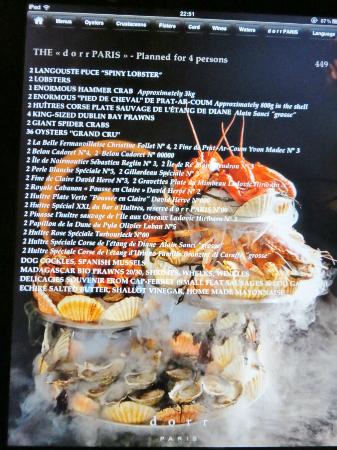
However, once you click through, the internal menus leave a lot to be desired. As you can see below, the readability is far from optimal. The text is small and in places is written over images. Moreover, you can’t pinch and expand. The terminals are “dumb” (as opposed to “smart”); as in, there is no further interactivity within the pages. There are no links within. There are zero opportunities for further discovery.
When implementing digital devices such as an Ipad in a customer-facing environment, there are many things to take into consideration to make for a user experience that is superior, for example, to the classic paper menu. Merely putting the paper menu on the iPad does not constitute an optimal usage of the technology and the investment. If the iPad initiative may yet be applauded as a first stab at becoming a ‘digital restaurant,’ there are many ways to make the experience much better.
Making full use of the digital interface
Here are the top five recommendations I would have made to Garry Dorr and his team to make the iPad experience better. They are by no means definitive and the cost of each is variable. The majority of these recommendations, however, are not complicated to put into place.
- Search. Allow for random access – include a search function that allows the customer to search for other items, for example, ingredients, sauces, etc.
- Increase interactivity. Make the pages interactive with cross-links (even with well selected outbound links). Examples of useful links could be: people who order this also order that. Beside each menu item, there could be a little bottle icon, indicating the restaurant’s recommended wine for that dish…
- Wifi. Since the iPads obviously had wifi, why not allow for internet access. At the very least, if access had to be limited, why not add Google Maps or some relevant touristic information! Otherwise, I would generally be in favor of giving full access.
- Collect customer data. It’s a crying shame not to use this device to capture customer information. What about an opt-in for a newsletter or invitation to subscribe/follow on social?
- Follow customer behavior. Since the device is digital, it would be very easy to track the clicking and swiping behavior of the customers. This could provide valuable information on what the customers like/don’t like.
Among other interesting options might be to allow customers to order from the iPad; especially for when the restaurant is very full. Personally, I would also integrate the wine list into the food menu. Whatever enhancements to be added, the focus must be on enhancing the overall customer experience. E.g. Ask what the customers would like to see by way of a quick survey as another tab on top!
Being real
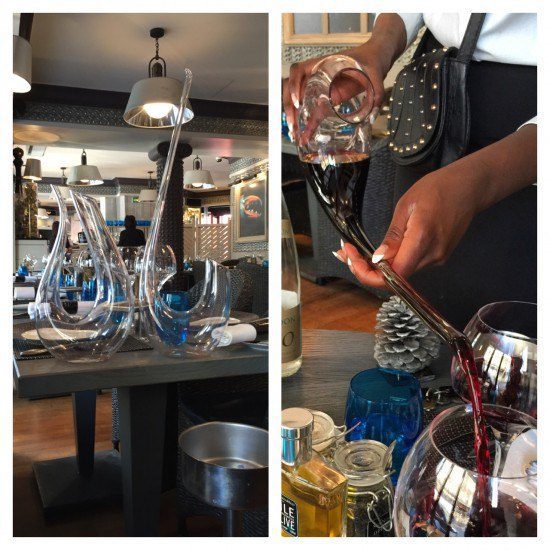
As much as this post is about the “digital restaurant,” it is not to say that the IRL experience must play second fiddle to digital. Banish the thought! To that end, and in recognition of the multi-sensorial experience, the restaurant has a decorous fish tank out of which the lobsters were directly fished in front of us. And, in conjunction with items for sale, the waitress used a selection of impressive decanters. The long spouted decanter (below right) was tricky to manage, but most enjoyable to observe.
On balance, Le Bar a Huitres is a fine establishment as far as culinary experiences go. As far as being a digital restaurant, we are still only as far as the “amuse bouche.” Garry Dorr may have iPads installed, a blog and a presence on Twitter, but, just as the iPads have yet to be fully exploited, the Twitter presence remains, well, at its very beginning (with a paltry 2 followers). And the blog is more a series of press releases than a proper blog (in French). Being and using digital does not have a one-size-fits-all, shiny-object easy solution. Some components of digital can cause disruption. Others require consequential staff training. There may also be technical and technological issues to resolve. If the restaurant were to include self-ordering, that would mean important differences in the process. These decisions and the processes applied would need to be taken into consideration with the client at the center of the affair. [Do please tweet this!]
Bottom line: I enjoyed the Le Bar a Huitres food more than the digital appetizer. And, I would encourage the management team to go much further with the iPads to enhance the customer experience and provide for a truly distinct and integrated approach.
Any thoughts and/or reactions?

