A main artery of a truly customer-centric organization has to be customer service. When products (the what you do, as Simon Sinek might say) become marginally distinguishable, the surrounding service and services will indubitably carry a differentiable and valuable impact. It has become fashionable for brands to talk about being “customer centric;” but as we know, in reality, it is often just lip service. On the web, in an increasingly transparent world and where customer service is more and more done “out in the open,” the customer service battle has taken on another level. I completely subscribe to the notion that customer service is (an important part of) the new marketing, as this 2011 Forbes article, by Matt Mickiewicz, described. {Tweet this}
Customer Service – the face of marketing
While not a scientific method, I wanted to look at how brands are positioning customer service on their websites. It does strike me as interesting to observe how upfront a brand will place the customer service option on their site. Notwithstanding the quality of the accompanying service (i.e. whether it is outsourced and/or has an automatic answering service, etc.), the first point is to see to what degree the brand wishes to propose customer service and/or provide an easy contact for the customer. Secondly, it’s worth inspecting what options they provide in order to get in touch. How easy do they make it to connect? In evaluating the Customer Service ‘marketing,’ I use four criteria:
- Prominence (presence at top of site)
- Flexibility (options)
- Mobility (presence and facility on the mobile site)
- Immediacy (e.g. chat, telephone number…)
Herewith are a couple of examples. One that is indubitably best in class. The other is definitely not.
ZAPPOS
Owned by Amazon and run by a patron of the art of customer service, CEO Tony Hsieh, Zappos is a standout. On its site, customer service is positioned top left, with a variety of easy and fast options: 24/7 telephone number, a help drop-down menu and live help. The tone is friendly and clear.
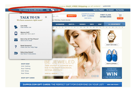
Walking in your customers’ shoes… literally
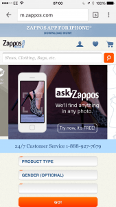
While the desktop web site gets a strong rating, on the mobile, Zappos can still improve a bit. For sure, 24/7 customer service is squarely on the home page (see below). Regrettably, however, that phone number is not clickable. You have to scroll down to get the one-click number. Then, the other miss (for me) is that the mobile site does not recognize that I am outside of the US and provide me with a number which I can call directly. The lack of the + for international calls sends me through to an error message.
L’OREAL PARIS
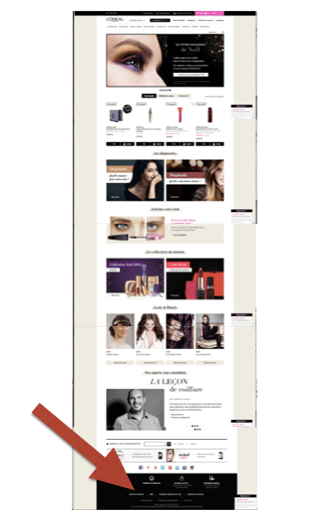
For a brand that is a regular top advertiser around the world (#3 according to Adbrands in 2013), you would imagine that the ads generate a lot of traffic to the website. As part of any sensible customer journey, the option to connect with the brand needs to be apparent. L’Oreal Paris has clearly a different viewpoint about the importance of customer service. On the Loreal-Paris.com (France) home page, you must have determination to get to the customer service options, scrolling down five pages to get there.
Customers at your service!
Accompanying you all the way down is a sticky widget, inviting you to address your questions to the “L’Oreal Paris” community. In other words, other customers. Driven by a service called “TokyWoky,” I found the app to be a bit unstable (it booted me out when I posted my first question). I note that someone did answer my question under 10 minutes (and was awarded 30 ‘points’ for doing so). In theory, this widget looks nice. In practice, I wonder to what extent it is effective and improves customer satisfaction and loyalty? As the link on the TokyWoky widget identifies openly: this “service” is designed to reduce customer support costs.

Customer service = data grab?
In any event, when you finally get to the black bar at the bottom of the site, you are given two options, including a discreet “contact us” which sends us to another page to encourage the customer to submit a considerable amount of data, including twelve obligatory fields. I was quite surprised to find that the UK and US versions of the site provided equally distant customer service options. In the US, the Contact Us presents a number of curiosities, not least of which is that hair problems are given an extra 1.5 hours per day versus makeup and skin care. You had also better not have any challenges over the weekend.
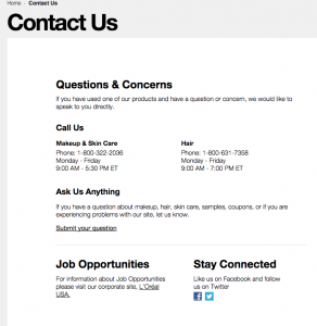
And, what is one to think of the plug to “like us on Facebook and follow us on Twitter” in the bottom right? Both social media have robust followings, but neither is dedicated to customer service per se.
Beauty on the fly?
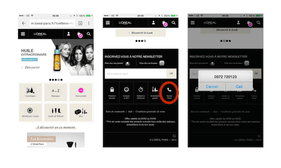
If the L’Oreal Paris website options for customer service are questionable, the mobile options are no less challenging. The mobile customer service option is a multiple scroll down and is limited to a call that, likeZappos, does not recognize my location and thus provides an error message when you call from outside France. The automated answering service took over three minutes to get a voice on the line. NB It only answers during the workweek (9-19h). Ironically, there was no TokyWoky on the mobile.
Customer Service can’t be made up
Customer service is such an important part of the customer experience, it is fascinating if not remarkable to observe how companies are strategically dealing with the question. To the extent the web provides visible and comparable approaches, with a little acuity, one can quickly gauge the customer service attitude of a company. In my opinion, it is fair to consider one’s customer service posture as a proxy for customer centricity. {Tweet this}
If a company is serious about customer centricity, the CEO (and leadership in general) must regularly put him or herself in the shoes of the customer to see what it is like to try to get service.{Tweet this} Without leadership actively onboard, the head of customer service will face a long struggle to garner the support and resources to provide a superior customer experience.
Your thoughts and reactions?





Nicely done. Always interesting to see the “do you need help?” Pop ups when I delay buying something on some ecommerce sites.
Also – fun activity – try to find any customer service options available on Google 🙂
I just read your post. It’s so true!
And to be honest, I never worried about the international syntax of the customer service’s phone numbers, but you are right. It’s important, especially for international brands or websites. A good point for You.
In my opinion, gauging the customer experience all along the process is critical, and from my personal experience, just a few number of companies really cares about it, and to be more precise, they are probably not aware of this. They are focused on the conversion rates (short-term), but they neglect the whole experience (long-term). Obviously, we have to deal with both. But as we can make some continuous improvements on any website, we should make continuous improvements on the whole experience. To begin, I suggest that every CEO of a company with an e-commerce website does not just place an order on his own website, but also try to return the product… Such a disappointing experience on too many websites, as huge are they.