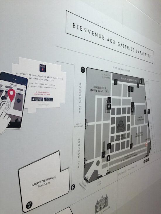
I was in the Galeries Lafayette, in Paris, last week to find a specific Christmas present for my wife and felt decidedly disoriented as I walked in. Happily, there was a map on the wall with, as a bonus, a geolocation app, specifically for the Boulevard Haussmann store. Without batting an eye, I went to download the app. However, the experience left me rather unfulfilled and I failed to make any headway on Christmas shopping. Here is a run-through of the ‘luxury customer experience’ as I saw it…
Thinking through the customer journey
When I went to download the app, I made a couple of observations. First, I saw to my right (not photographed) two Galeries Lafayette personnel gleefully (and openly) talking about some personal matters. Neither saw fit to engage with me. Somehow, the digital interaction often has a way of discouraging store personnel to interact with customers (too personal, not enough training, service orientation?).
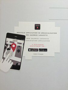
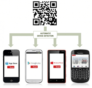
Secondly, when I went to download the app, I had to open up the app store on my iPhone and find the app. The one I was supposed to find was the second one in the list (of four available). I downloaded the first one by mistake. It is interesting to dissect the choices made on the instore panel (see left). The words are almost bilingual, French/English, and at the bottom, in small print, there is written in English “Available in 14 languages.” If the image on the left, with the finger on the iPhone, is descriptive, I suggest that the operation of going to the App Store could have been enhanced by adding a QR code that automatically detects which app store and the right app (see below). The QR is something of an international (if geeky) language. {Tweet this!}

[P.S. I checked and can confirm that the Galeries Lafayette offers free wifi for the traveling and roaming customer.]
Once I had downloaded the correct app, I opened it up and the app then neeeded to “update”. This took around 30 more seconds. All I could think about was the data download. How many MBs would be sucked out of my telco plan? The loading bar ‘Update information‘ had to go through two passes before completion. And, note that I was on 4G, so one can only imagine the reduced speed for slower connections.
Landing page – first impressions
Having jumped through those hoops — and I sincerely doubt that many less geeky shoppers will get this far — I was met by the below landing page:
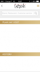
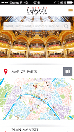
Totally underwhelming. For purposes of writing this post, I have since noticed that they have altered the landing page to be a more decorous experience, although I had to wonder why the main feature is now a map of Paris, when the purpose of the app was to help me find my way around the store in which I already was? Assuming that the app were clever enough to know that I am no longer in the store, an interactive map could have been an interesting alternative, I’d say. Unfortunately, the said map of Paris is remarkably a static, low quality and undetailed image.
Search is a vital part of the user experience
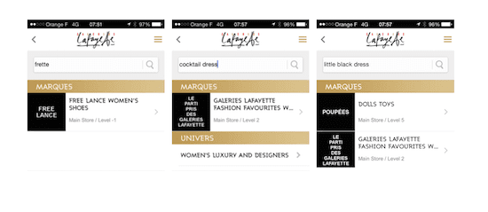
Not only is search a fundamental part of digital marketing, it is an absolutely key component in the mobile experience to the extent that one tends to be much more task specific in one’s mobile surfing. {Tweet this!} The Galeries Lafayette app provides a plum search bar at the top, inviting me only to search for brand, restaurant and customer service. I am not sure that we all come looking just that way. Granted, that is how the store is organized. However, as a customer, I was looking for an item, not a specific brand. I put in the first brand that came to mind. Fail! Up came “FREE LANCE” women’s shoes. I then thought about a cocktail dress, which led to the 2nd floor with no specific dresses. I tried a third one for fun: “little black dress” (something of a classic, I thought), and got Dolls Toys (5th floor) as well as a generic invitation to the 2nd floor for women’s fashion favourites. Tagging is a vital component of search. Surely, there are some worthwhile tags on the ecommerce site that could be imported here?
Purpose
What is the purpose of this app? I never got to the bottom of it, but they write that the app is:
- to prepare your shopping trip
- to create itineraries from one shop to another
- find your way around using interactive floor plans
- … and to share your location with friends on social networks.
I note that the share functionality is modest, at best.
Bottom line: the app does not represent a luxury customer experience. At this point, I trust some test & learn will encourage an improved v2! So far, I note that the app has one “positive” (trustworthy?) review in the French iTunes store (no reviews in the US store). Anyone else seen department store apps of note? Please don’t hesitate to drop the names in the comments and I’ll go check them out!

