Let’s get visual.ly
This week’s interesting site*, Visual.ly, is an aggregator of infographics, a whole new “industry,” that has exploded onto the scenes, and a reflection on our times. In a world where we are swamped with information and starved for time, the visual representation of data is eye-catching and effective. Every day we are hit with 1+ billion pieces of content on Facebook (source Facebook stats), 350 billion tweets on Twitter (source TwitterEng Tweet) and 3 billion views on Youtube (source YouTubeBlog) — numbers that are probably still accelerating even as we speak.
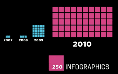
Below is a screen capture from Visual.ly’s video explaining the growth of infographics. The site offers a whole host of infographics by category. You can also create your own with their help (in the Labs section). It’s a central place for graphic artists who are creating their own infographics. Among other things, it’s good eye candy, which brings me to the last point: just because it is an infographic does not mean that it is true. The infographic is deceptive in that it tends to look official and formal. However, I have seen many with misinformation. All the same, infographics are a tremendous tool when done well and add spice to presentations.

*This is a regular posting on Friday’s where I identify what I think is an interesting site. Please do tweet it out if you like it, too! #interestingsite


Trackbacks/Pingbacks