Being a frequent Eurostar traveler and a bit geek, it was only natural that I noticed that Eurostar have laid down some new social media tracks! First, I must tip my hat to Eurostar’s responsive Twitter customer service account. Over the summer, Eurostar created a social media booth in the waiting area after you have cleared passport control, pictured below at Gare du Nord. There is the same booth at St Pancras snuck around to the left when you go into the main waiting area.
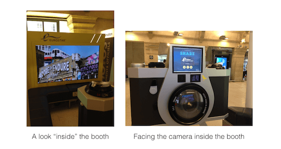 Eurostar Social Media … for the world to see
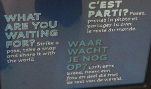
The Eurostar social media booth, which measures roughly 10m², invites you to:
Strike a pose, take a snap and share it with the world“
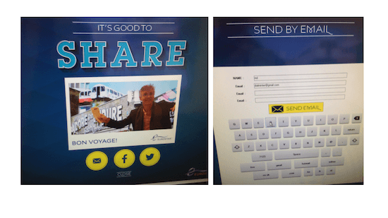
It was an invitation hardly lacking in ambition. Intrigued, I had to try it out. There certainly wasn’t a long queue of people fighting to take their shot, which I would attribute to a rather discrete way of communicating the purpose of this new installation. After opting for one of three languages, I chose a background from a selection of eight different shots of London and Paris. The one I selected was the graffiti-emblazoned tube station with the tag: “Let’s adore and endure each other.” Then I basically had 5 seconds to strike my pose. The camera and the image you see on the screen is reversed, so on this basis, it’s quite confusing as to which hand to raise not to obscure the text (fail!). On top of that you kind of have to bend down to be within the camera’s lens. In any event, I endured and confirmed the photograph. Then I had a choice of three options to broadcast to “the world:” via email, Facebook or Twitter.
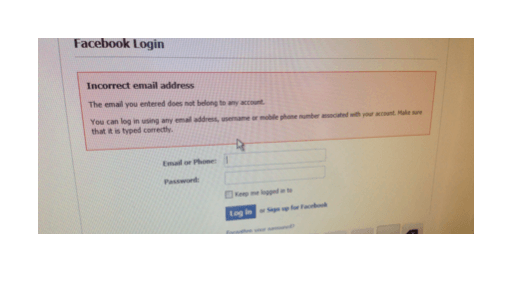
If I ended up sending the photo to myself via email, it was because my attempt to use Facebook share didn’t work out. Here, I encountered a second (and far more bothersome) fail. The issue? When you type in your password (which, for me, is now an obligatory long and complex string of numbers, symbols and characters), you cannot verify that each key you touched is right (when done right, you normally see the character before it vanishes behind a bullet point). The inevitable happened… Login Fail. [Total transparency: the first time, it was my fault since I actually entered an incorrect email address, whoops). The second time, however, unsurprisingly I failed to get my password right. Double Darn.
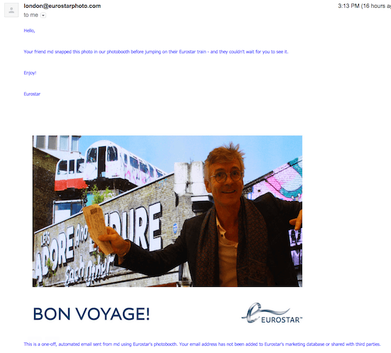
Having become frustrated with the Facebook login interface, I moved to the email option and decided to send myself the photo. Here is the email that the system spits out:
Aside from a frightful layout (small text, huge line spacing…), there was no option for me to customize the message. The automatic message is: “Hello, Your friend [md] snapped this photo in our photobooth before jumping on their Eurostar train – and they couldn’t wait for you to see it. Enjoy! Eurostar.” I find that it’s kind of odd that the email is from Eurostar.
Where did Eurostar miss a beat?
While I applaud the initiative, the only true way to judge this social media booth is, first, to understand appropriately the company’s objectives — which are, of course, not known. Secondly, one needs to understand the expense of such an installation and measure against the intended outputs/objectives. All the same, there are some evident conclusions that can be made:
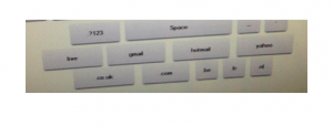
 Keyboard user experience. On the plus side, the touchscreen keyboard worked and it has added shortcut buttons at the bottom for gmail, hotmail and .co.uk, .be, .nl and .com. However, these type of onscreen keyboards are often unfriendly and this one has its hiccoughs. Most poignantly, when you type in the password, there is no way to see which key was typed (before the character vanishes behind the bullet point). You can’t afford to have someone making mistakes when we are now so accustomed to the autosave of our devices! Also, the position of the screen is a little low which means that you must lean over to aim at each button correctly.
- Email engagement. The automated email message is a blanket message that is decidedly dry and signed Eurostar (hardly engaging). The email has no further call to action. It doesn’t even include a link to Eurostar (I might even have included a little button to the Eurostar Facebook or Twitter accounts). In the realm of good ideas, meanwhile, Eurostar adds a disclaimer on the bottom of the sent mail: “This is a one-off, automated email sent from md using Eurostar’s photobooth. Your email address has not been added to Eurostar’s marketing database or shared with third parties.” Right on!
- Email opt-in. When I went to send the image via email, Eurostar might have offered an opt-in to some kind of further communication. Not that I would have chosen to opt in, but it is, all the same, a wasted opportunity to build an email list with more “engaged” customers.
- Social. When wishing to foster social engagement, it is important to make the process as painless, secure and seamless as possible. {Tweet this!} The Facebook login is tortuous enough. The Twitter process is no easier. And, to wit, not secure. When I used the photobooth for a Twitter share, the previous user had not been logged out. Thus, I was unfortunately retweeted under his Twitter handle. (see below). And there was no ability for me to re-sign in under my own account. Huge social fail.
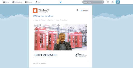
Eurostar social media engagement
I would surmise that, in the board rooms, the stated corporate objectives of this booth are a combination of (1) softening the waiting time experience and (2) getting some social love. However, one thing seems completely clear: the top executive team never tried it out themselves otherwise they would have quickly seen the inadequacies. This kind of poor user interface is so obvious to detect with one run-through. As a result, Eurostar has missed an opportunity for greater engagement and I would not be surprised for the booth to disappear within 12 months time. In these kinds of installations, it’s not enough to have a “nice idea.” You must execute with great precision. {Tweet this!} Bugs are bound to happen; but in this case, the flaws are built in. It reminds me of the rather imperfect recharging booth (that has since been improved). I wonder if they have planned (i.e. budgeted) to change the background photos and upgrade the system to encourage repeat usage over time?
Personally, I would much rather that Eurostar spend their energies to provide wifi access on the train!
So, in the end, it’s let’s adore and endure…a little better user experience.




Gotta try that Friday!