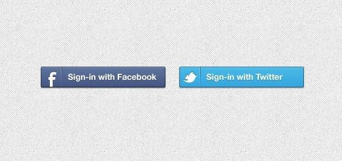
Do you agree that one of the pleasures of the web is the Facebook connect or Twitter connect button? It saves that downer of having to store and retrieve yet another password. Okay, so it also poses a risk that FB or Twitter will abuse your data. But, on balance, I like it. What about you?
True Blue
Both these buttons are now familiar sites across the web. The Facebook blue and Twitter blue have become rather imprinted (favorably to-date) on my mind. In both of them, we have what we could define as an iconic Facebook royal blue and a Twitter sky blue.
Thus, I was mildly surprised to see this, below, on the Khan Academy homepage (that wonderfully disruptive educational site). I had to do a double take:
Anyone else find that funny? Or confusing?
Google Blue ?
 So, Khan Academy is certainly not the only one to “make up” a singular Google color. If there are two letters in Google that are blue, the Google blue itself is graduated. One of the glories of Google is its ever mutating home page and its reflexive creativity. {Click to Tweet} Google has no worries in playing with its logo. That said, I believe that there is a need to own a visual territory online. Per brand marketing 101, color is one. For me, the Facebook blue is becoming a well known territory, as is Twitter’s sky blue. The question for Google is should they not worry about owning a recognizable color? Should they create a singular branded color, such as a specific Google Blue?
Google marketing rules
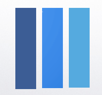
 In a world of plethoric messages, brand identity could hardly be more important. Brand color is surely one of the markers of a territory. For Google, the way they treat their logo is pioneering – with their disorderly RGB primary colors. ”There were a lot of different color iterations,” said Ruth Kedar [the artist who came up with the Google logo]. “We ended up with the primary colors, but instead of having the pattern go in order, we put a secondary color on the L, which brought back the idea that Google doesn’t follow the rules.” (Extract from an interview with Ruth Kedar by WIRED writer Sonia Zjawinski). However, taking a look on a computer screen at the three bars below, between the Google Blue and the Twitter blue, there is not much to it (at least, compared with Facebook’s).
So, the funny thing is that I began this post over the weekend. Imagine my TRUE GOOGLE BLUE surprise this morning when I discovered the Google Blue Mail video via Mashable. Enjoy! {Click to Tweet out!}. Anyway, what’s the deal with all the these big three web players using a blue button? All trying to reassure us with the peaceful, rational blue?
Meanwhile, the question remains: is there a need for Google to create and occupy a Google Blue? Your thoughts are welcome!

