In my ongoing analysis of the Presidential campaigns, I thought I might stop and look at the Facebook page layouts that Romney and Obama had. Some good and bad points, in my opinion. Whether I am right or wrong, the major point of this post we must all develop a social media critical eye. Here below, then, you will find my comments in pink for the positives, in green for the negatives.
Obama Facebook critique
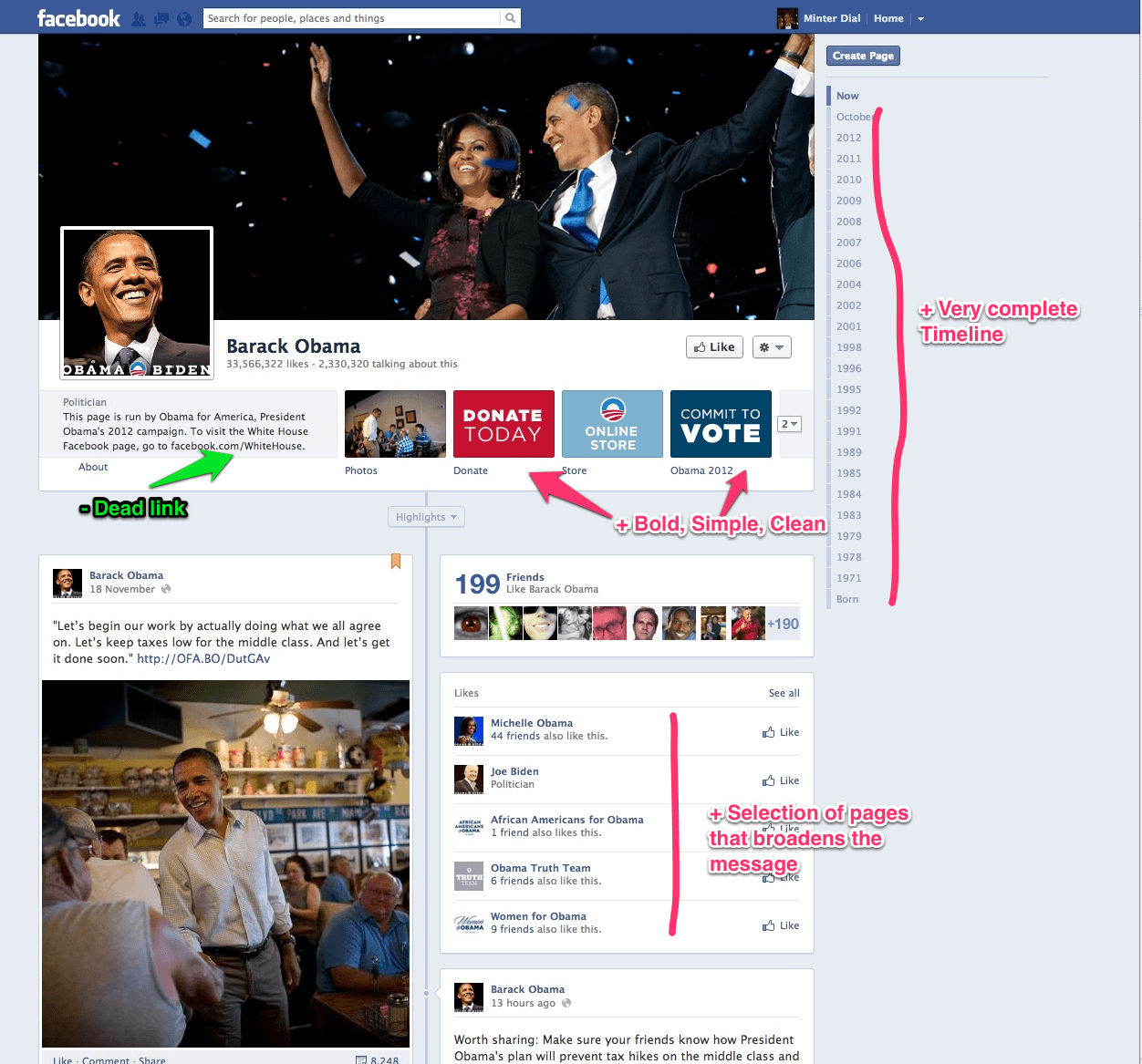
- Obama’s Facebook page as of November 21, 2012
On the Obama Facebook home page, what I like is the strong use of tabs, with clean text on a bold color. The Obama timeline on the right looks complete. The section with other “similar” pages has a roster that speaks to his platform (and his electorate). In the space under the inset photo, the one fault I find is that the link to the other Facebook page is a dead link, which is a shame. Meanwhile, I’d note that the images that he is using (top frame and the inset) are coherent and engaging.
Romney’s Facebook page critique
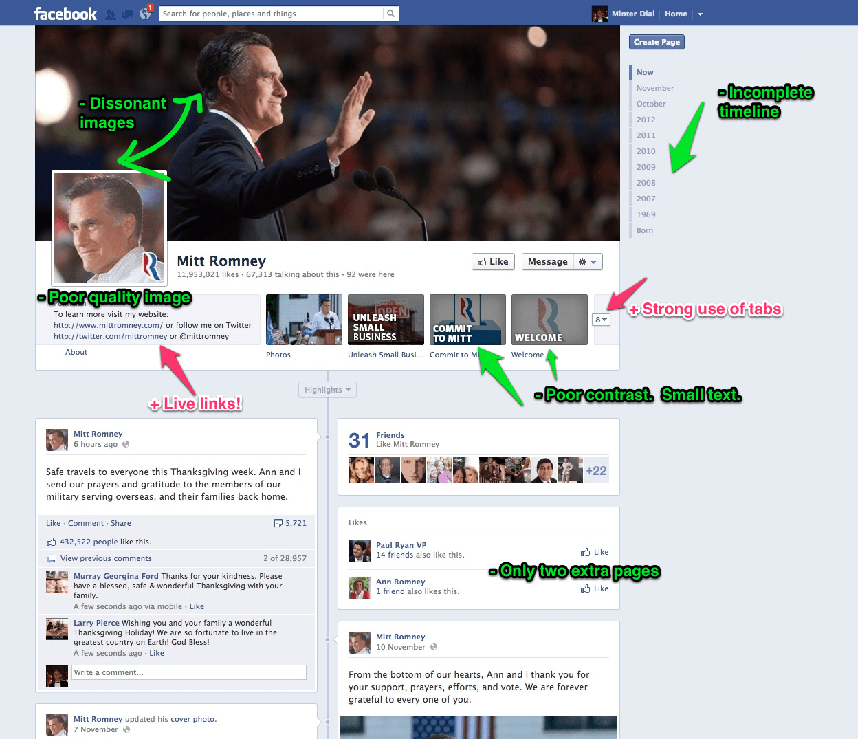
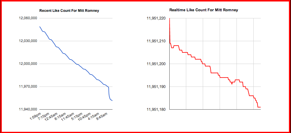
On the Romney page, where I will note that Romney has reappeared to wish people a Happy Thanksgiving (today), here are my comments. Since he lost the election, there has been a well publicized exodus of fans from his page, as tracked in real-time by this Disappearing Romney site (see below).
As you can see by my mark-ups, there are a few more things I found wanting on Romney’s Facebook page versus Obama’s page. Even if Romney did at times enjoy a higher People Talking About (PTA) rate, his Facebook home page execution was not optimal. For starters, the two top images are completely dissonant, with the cover image looking one way and the other inset image looking the other way. The inset image is of inferior quality, which is especially surprising for its size. The timeline is decidedly short and, typically, could be read as a less transparent posture. The other ‘similar pages’ section only has two choices: VP Ryan and Ann Romney, a lost opportunity to share Romney’s values. And in the tabs area, even if there was an abundant use of them, is not optimally designed. The small white text on a greyed out area makes them less than easy to read. On the positive side, there are live links in the text “About” section.
Maintaining your profile
Even if you don’t plan immediately to come back to politics, the point about social media is that it is not a fly-by-night activity. Especially as a public figure, one must consider one’s social media presence as an ongoing part of one’s reputation, one’s life. If Romney wants to return to politics and, thus to social media, he must not burn the bridge and abandon it, only to “reignite” when HE wants it. Building community and support is a long-term process, never more so than on social media. {Click to Tweet out!}
My hope is that, with this post, we can pursue and sharpen our social media critical eye!
Your thoughts? Have I missed anything? Will be glad to hear your points of view.





The digital political campaigns are just emerging, it's going to be decisive to learn the audience, the tactics, the strengths and weaknesses,etc… Digital is going to play a significant part into political market intelligence, like it should be in the business world.
The digital political campaigns are just emerging, it's going to be decisive to learn the audience, the tactics, the strengths and weaknesses,etc… Digital is going to play a significant part into political market intelligence, like it should be in the business world.
I seriously love your website.. Excellent colors & theme.
Did you build this amazing site yourself? Please reply back as
I’m hoping to create my very own site and would like to know where you got this from or just what the theme is named. Cheers!
I seriously love your website.. Excellent colors & theme.
Did you build this amazing site yourself? Please reply back as
I’m hoping to create my very own site and would like to know where you got this from or just what the theme is named. Cheers!