via businessman.com
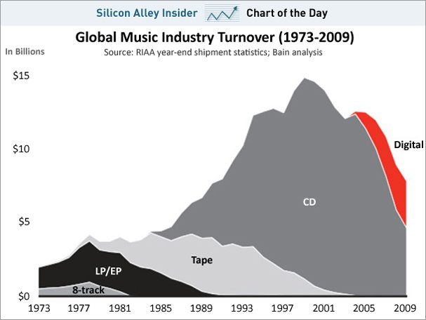
A graphic display of the state of the music industry created by Bain…. What it speaks to is the head-in-the-sand approach that the industry had as a whole as the internet wave took over, reaching its peak in 1998. Technical chart readers will notice the perfect head & shoulders shape of the decline. Classic stuff. Clearly, digital sales are not to suffice. The industry will need to find a new way to entertain and render the value added of its artists.
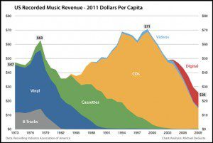
ADDENDUM: The revised (new & improved) chart (thanks to Mike in the comments below) from Business Insider:


The graph shows decline per physical support… But it’s been several years now since the music industry understood it has to find other revenue sources (esp. events, concerts, edition, …).
I’d really like to see the ratio of CD/digital sales in those companies revenues.
Minter,
The graph has been corrected, with several additional graphs:
http://www.businessinsider.com/these-charts-explain-the-real-death-of-the-music-industry-2011-2
Here are some important points coaxed from the data:
Cheers,
Mike
@PJ Grizel: You are right that they have known for a while… They certainly have taken a long time to shift gears! What I would like to see is the business model concerning concerts, tickets & merchandising…
@Mike: thanks for the corrections and the most revealing stats. It makes me wonder how musicians are faring in all that? What’s working? Niche music, playing at clubs, genius kids on YouTube?