When, how and where I want it…
Luxury brands often have it tougher than the mass brands. First, on balance, their customer is decidedly and deservedly more demanding. A big component of this “exigency” relates to time. Secondly, the average luxury customer has more disposable income and, therefore, access to pretty much any type of communication. Thirdly, because of the concerns of privacy, there is even less tolerance of error when it comes to data protection. Lastly, luxury brands do not generally have the prowess or resources to create a great standalone online experience, . There are five things that I am increasingly paying attention to when it comes to web design, and even more so for luxury web design:
- Brand story and online sales (eCommerce)
- Customer service ‘readiness’
- User experience
- Mobile experience
- Check out and payment facilities
Jaeger-Lecoultre is a genuine luxury brand. Its website, somehow, is a classic luxury online experience. Some parts are great, some are sub-optimal, by rather ordinary standards.
Jaeger-Lecoultre’s home page
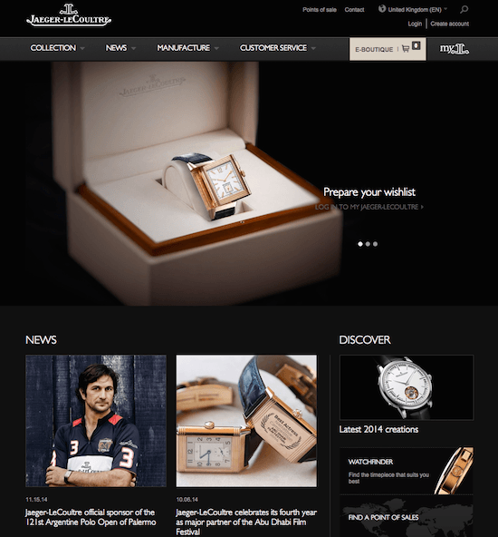
On the plus side, the layout is generally elegant and readable (i.e. not too small). However, the text “LOG IN” is hard to make out over the image. Secondly, there is a plethora of type faces and sizes. It seems that every title has a different configuration. On the positive side, I find it intriguing that a luxury brand can generate a “NEWS” segment. Also, I like the fact that JLC puts its customer service option upfront in prime real estate (4th tab).
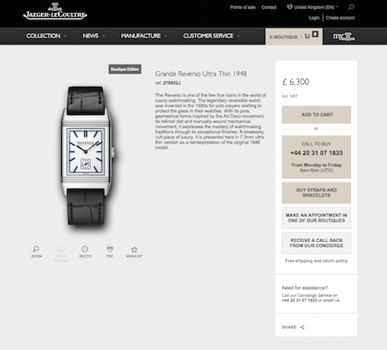
Luxury eCommerce environment
When moving from the “brand” environment to the eCommerce component, all of sudden we drop the black background and move to a grey background with a specific beige color, signified in the E-Boutique tab. I’m not sure why there needs to be such a different space; although putting black text on a light background is probably easier to read, especially when there is so much text to read. The size of the text on the website leaves something to be desired for the visually challenged. But, what is remarkably well done is the array of options unde the price: add to cart, call to buy (with a number that understood that I was in the UK at the time of my visit), make an appointment, receive a call back…
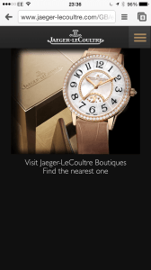
Mobile luxury experience
The mobile version of Jaeger-Lecoulture.com is definitely mobile friendly. There are some curious choices made, including having the radiator on the far right, the large black empty panel on the bottom half. Another failing, in my opinion, is not having a search bar anywhere to be found. Definitely, room for improvement.
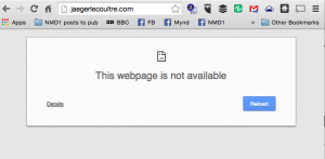
Webmaster Error – You cannot leave your domain name like this!
Meanwhile, there are other, less obvious components to making a website experience good, including the findability of the website. Especially for a brand whose name is quite tricky to spell, you would imagine that the webmaster team had tried to find ways to help “spelling challenged” individuals. However, what cannot be excused is not having bought (and redirected) JaegerLecoultre.com, all attached, as opposed to the Jaeger-Lecoultre home URL.
So, like many luxury brands that are making efforts to manage the omni-channel customer, but are limited in their means and knowledge of the ways of the web (and mobile), there is plenty of opportunity for the luxury brands to learn and improve. It should be noted that JLC does some things right. Now, to prioritize the work for the new year!
Your thoughts and/or reactions to my assessment?


Trackbacks/Pingbacks