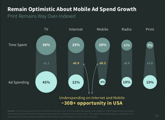
As organizations continue to zero in on their digital strategy and to build a digital transformation plan, top executives need to make sure that their own Digital IQ is satisfactory in order to make the best decisions. Taking a cue from the obsessive Steve Jobs, who was dedicated to user experience (UX), executives need to understand the customer journey and make the customer experience (CX) remarkable, worth talking about. As part of that customer experience, the mobile is playing an ever-growing part. Yet, the mobile experience is still far from embedded into marketing strategies (much less board room meetings). To wit, as the latest Mary Meeker 2014 Internet Trends report identifies, marketing teams in the US continue to underweight marketing spend in mobile and overweight in traditional print.
Slide redesigned by Emiland (Paris based)
As Meeker states, mobile data traffic is growing fast, up 81% year-over-year. Looking at video consumption alone, mobile is now 22% of total. Yet, many mobile sites are anything but a good experience. Below are some rather standout performances that I have classified in descending order: the ugly, the bad and then (how to get) the good.
The Ugly Mobile Experience
There are some frighteningly horrible mobile sites that defy logic much less eyesight. Many sites have merely shrunk down their website onto the mobile screen. Below are a couple of mobile sites that really jump out as veritable eye-sores. The really shocking thing for Lingscars and Arngren is that they are (according to Alexa), respectively, the 94,000th and 312,000th most visited sites in the world.
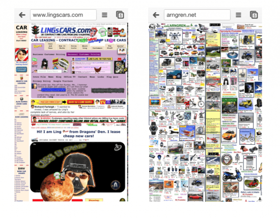
Mobile Misexperience – Lingscars.com & Arngen.net
The Bad Mobile Experience
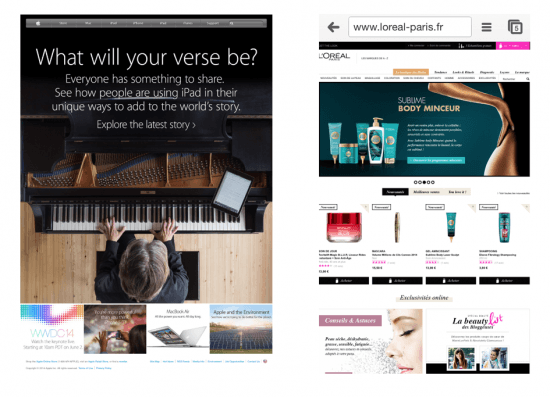
If the above examples are coming from companies with less-than-sophisticated marketing teams and customers, a poor mobile experience can be discovered on any number of well-known brands, not least of which are Apple, L’Oreal-Paris (.fr), Lancome and LVMH (corporate). The first two sites below look more like a web site pared down for mobile and rely on the pinch and zoom. For Apple, the 48th most visited site in the world, this is obviously a strategic decision. However, it doesn’t diminish my belief that it is a poor mobile experience. For L’Oreal, with all its marketing might, you would expect better as well (not to mention the fact that they immediately spring a pop-up to push you to download an app… to buy their products). It’s worth noting that L’Oreal Paris USA has a mobile-friendly site.
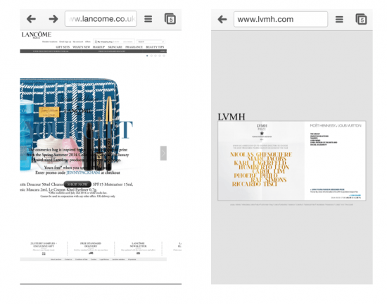
Continuing the demonstration of poor mobile experiences, Lancome, which is considered a “luxury” brand in the L’Oreal portfolio, has a mobile site that is nothing shy of a travesty. Despite aiming for the luxury category, Lancome has massively different experiences online from one country site to another. The Lancome UK mobile site (pictured below left) has major issues of navigation and readability. Meanwhile, LVMH Louis Vuitton Moet Hennessey, the corporate holding company, has a landing page that is anything but aesthetic and requires pinch and zoom just to read the text, despite only having only a few words to read. The text is in landscape, with acres of useless grey space above and below.
The Good – 8 steps for to improve the mobile experience
Getting the mobile experience right is not an easy task, especially when you are coming from the desktop mindset. Herewith is a checklist of 8 steps for making the best possible mobile experience:
- Findable. As gorgeous as your mobile site or app is, it must first be found. This applies equally to finding apps in the app store as well as sites on the mobile web. In a Google (or Bing/Yandex/Baidu) search on the mobile, the premium of being in the top position becomes even more paramount.
- Loadable. Given that internet access speeds are frequently slower on the mobile, it is important to make sure that the site loads quickly. According to an article from 2008 in GigaSpaces, Amazon found that 100ms of latency cost them 1% in sales. I am sure that expectations and impatience levels have not improved since then! For starters, images and videos must be optimized.
- Simple. Considering the smaller screen, simplicity on the mobile is akin to elegance. {Tweet this!} Choosing what not to feature can be a character strengthening exercise. Simplicity is at the junction of efficiency and esthetics.
- Navigable. It’s important to provide the best and easiest journey to a satisfying result for the maximum number of our your target audience. Navigation bars and nomenclature should be clear and easy to use.
- Searchable. Considering the reduced size of the interface, the ability to search directly for a specific item becomes a necessary part of a mobile user experience. The notion of excellent internal tagging cannot be overlooked. {Tweet this!}
- Functional. Certain functionalities are particularly appropriate for the mobile interface. For example, if a “find a location” is part of the intention, the geo-location and map should be seamless. Functionality that is buggy or not adapted to the mobile interface should be ditched.
- Social. To the extent people use the mobile most for the social media experience, it would be sensible to make sure that there should be a social sign-in. The brand’s social media presence should be easily accessible on the mobile site as well, not stuck down in some footer after-thought. [This doesn’t apply, of course, if the brand has eschewed social media marketing]
- Responsive. Given the plethora of mobile devices and models — and there won’t be any let up anytime in the near future — it seems that a responsive design is the way to go.
There are many components that go into making an excellent mobile experience. The key point is to start with the customer journey in mind, and look at the mobile as a part of the journey. One point that goes for all sites, mobile or not, is clearly having great content. Taking into consideration the customer journey and the context in which a user might consume media on the mobile (commute, on the move, in queues…), there is room for adapting the content to be most relevant and digestible in byte sizes. For examples of good mobile sites, I like to reference interfaces such as Jelly and Tinder. These may be mobile-only and pure players on the web; however, this should not stop them from providing inspiration for traditional businesses.
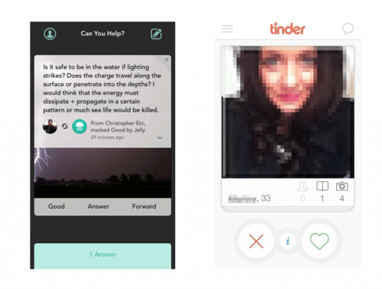
Jelly and Tinder – inspirational mobile interfaces
In business, I would consider Ugg Australia, Louis Vuitton (the brand), Gilt and Salesforce as standouts.
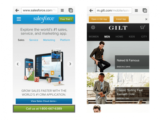
Salesforce & Gilt – great mobile experiences
Glad to hear any other points of view, including other recommendations for Good, Bad & Ugly!


Trackbacks/Pingbacks